- License
- Tutorial
- Buttons
- Checkbox/Radio/Toggle
- Dropdown/Dropup
- Inputs
- Textarea
- Select Bootstrap
- jQuery Tagsinput
- FileUpload Jasny
- Navigation
- Headers
- Subscription Area
- Footers
- Comments Area
- Pagination
- Progress Bars
- Sliders
- Labels
- Tables
- Bootstrap Datetimepicker
- Parallax
- Modals
- Collapsable Groups
- Tooltips/Popovers
- Material Icons
- Notifications
- Info Areas
- Cards
- How to setup Google API Keys
- Sections & Main
- Changing Colors (SASS)
- Moving Components
License
Currently, on Creative Tim you can get the products with two types of licenses: Personal or Developer. All the freebies are licensed to Personal License as default. If you are making a paid purchase, be sure to go through the table with the rights and the guidelines, so you can know what is the best fit for you. View the rights table and the description for each license on our Official License Page.
Short Description and Usage
Material Kit Pro is a beautiful resource built for Bootstrap. It was made over the powerful Bootstrap Material Design. We used and have redesigned all components to make it look flat, minimalist and easy to use. We are proud of this new Bootstrap skin and the possibilities for customisation.
Using it is very simple and it will enable you to refresh you classic looking application. To get the desired effect you will also need to integrate JS plugins that take a little bit more effort. It the end the result will be worth it.
Getting Started
The Material Kit Pro is built on top of Bootstrap 3, so you can safely use it on your existing or new Bootstrap project. No line of code from Bootstrap 3 was changed, so you don't have to worry about undesired effects in your work.
The easiest way to start is to use our start-up template where all the files are already included and ready to use.
File Structure
Once you have downloaded the archive and opened it, you will find the following structure:
Let's take it one by one:
	material-kit
	├── HTML
	│   ├── Creative\ Tim\ License.pdf
	│   ├── assets
	│   │   ├── assets-for-demo
	│   │   ├── css
	│   │   │   ├── bootstrap.min.css
	│   │   │   ├── material-kit.min.css
	│   │   │   └── material-kit.min.css.map
	│   │   ├── img
	│   │   ├── js
	│   │   │   ├── bootstrap-datetimepicker.js
	│   │   │   ├── bootstrap-selectpicker.js
	│   │   │   ├── bootstrap-tagsinput.js
	│   │   │   ├── bootstrap.min.js
	│   │   │   ├── jasny-bootstrap.min.js
	│   │   │   ├── jquery.flexisel.js
	│   │   │   ├── jquery.min.js
	│   │   │   ├── material-kit.min.js
	│   │   │   ├── material.min.js
	│   │   │   ├── moment.min.js
	│   │   │   └── nouislider.min.js
	│   │   └── sass
	│   │       ├── material-kit
	│   │       └── material-kit.scss
	│   ├── examples
	│   │   ├── about-us.html
	│   │   ├── blog-post.html
	│   │   ├── blog-posts.html
	│   │   ├── contact-us.html
	│   │   ├── ecommerce.html
	│   │   ├── landing-page.html
	│   │   ├── login-page.html
	│   │   ├── pricing.html
	│   │   ├── product-page.html
	│   │   ├── profile-page.html
	│   │   └── signup-page.html
	│   ├── index.html
	│   ├── presentation.html
	│   ├── sections.html
	│   ├── template.html
	│   └── tutorial-components.html
	├── Photoshop
	└── changelog.txt
Restyled Components
Here is the list of Bootstrap 3 components that were restyled in Material Kit Pro:
- Buttons
- Inputs
- Select
- Textarea
- Menu
- Dropdown
- Progress Bars
- Navigation Menu
- Pagination
- Labels
- Notifications
- Typography
- Images
- Tables
- Tooltips
- Popovers
- Modal
- Carousel
New Components
Besides giving the existing Bootstrap elements a new look, we added new ones, so that the interface and consistent and homogenous.
Going through them, we added:
- Tags
- Checkboxes
- Radio Buttons
- Sliders
- Toggle Buttons
- Raised Areas
- Cards with tabs
- Datetimepicker
- Material Icons
- File Uploader
- New Modals
Buttons
Colors
We worked over the original Bootstrap classes, choosing a different, slightly intenser colour palette. We have also added a pink button, defined by the .btn-rose class.If you want to have a disabled button, you can add .disabled class.
<button class="btn btn-default disabled">Disabled</button>
<button class="btn btn-default">Default</button>
<button class="btn btn-primary">Primary</button>
<button class="btn btn-info">Info</button>
<button class="btn btn-success">Success</button>
<button class="btn btn-warning">Warning</button>
<button class="btn btn-danger">Danger</button>
<button class="btn btn-rose">Rose</button>
Sizes
Buttons come in all needed sizes:
<button class="btn btn-primary btn-lg">Large</button>
<button class="btn btn-primary">Normal</button>
<button class="btn btn-primary btn-sm">Small</button>
<button class="btn btn-primary btn-xs">Extra Small</button>
Styles
We added extra classes that can help you better customise the look. You can use regular buttons, rounded corners buttons or simple buttons. If you are using buttons that only have an icon inside of them, you can add .btn-just-icon so the icon properly aligns. Let's see some examples:
<button class="btn btn-primary ">Default</button>
<button class="btn btn-primary btn-round">Round</button>
<button class="btn btn-primary btn-round">
	<i class="material-icons">favorite</i> With Icon
</button>
<button class="btn btn-primary btn-fab btn-fab-mini btn-round">
	<i class="material-icons">favorite</i>
</button>
<button class="btn btn-primary btn-simple">Default</button>
Button groups, toolbars, and disabled state all work like they are supposed to. We used the Font Awesome icons that can be found here and Material Design Icons that can be found here.
Social
We have created special buttons for the main social networks. You can use the buttons with any styles, you just need to add the class .btn-[#social-network] for the button to have the brand colour of the network.
<button class="btn btn-fab btn-twitter">
    <i class="fa fa-twitter"></i>
</button>
<button class="btn btn-just-icon btn-twitter">
    <i class="fa fa-twitter"></i>
</button>
<button class="btn btn-twitter btn-just-icon">
    <i class="fa fa-twitter"></i>
</button>
<br />
<button class="btn btn-fab btn-facebook">
    <i class="fa fa-facebook"> </i>
</button>
<button class="btn btn-fab btn-google">
    <i class="fa fa-google"> </i>
</button>
<button class="btn btn-fab btn-linkedin">
    <i class="fa fa-linkedin"></i>
</button>
<button class="btn btn-fab btn-pinterest">
    <i class="fa fa-pinterest"></i>
</button>
<button class="btn btn-fab btn-youtube">
    <i class="fa fa-youtube"> </i>
</button>
<button class="btn btn-fab btn-tumblr">
    <i class="fa fa-tumblr"> </i>
</button>
<button class="btn btn-fab btn-github">
    <i class="fa fa-github"></i>
</button>
<button class="btn btn-fab btn-dribbble">
    <i class="fa fa-dribbble"></i>
</button>
<button class="btn btn-fab btn-reddit">
    <i class="fa fa-reddit"></i>
</button>
<button class="btn btn-fab btn-instagram">
    <i class="fa fa-instagram"> </i>
</button>
Checkboxes
To use the custom checkboxes, you don't need to import any separate Javascript file, everything is inside material.min.js
<div class="checkbox">
	<label>
		<input type="checkbox" name="optionsCheckboxes">
		Unchecked
	</label>
</div>
<div class="checkbox">
	<label>
		<input type="checkbox" name="optionsCheckboxes" checked>
		Checked
	</label>
</div>
<div class="checkbox">
	<label>
		<input type="checkbox" name="optionsCheckboxes" disabled>
		Disabled Unchecked
	</label>
</div>
<div class="checkbox">
	<label>
		<input type="checkbox" name="optionsCheckboxes" disabled checked>
		Disabled Checked
	</label>
</div>
Radio Buttons
To use the custom radio buttons, you don't need to import any separate Javascript file, everything is inside material.min.js.
<div class="radio">
	<label>
		<input type="radio" name="optionsRadios">
		Radio is off
	</label>
</div>
<div class="radio">
	<label>
		<input type="radio" name="optionsRadios" checked="true">
		Radio is on
	</label>
</div>
<div class="radio">
	<label>
		<input type="radio" name="optionsRadiosDisabled" disabled>
		Disabled Radio is off
	</label>
</div>
<div class="radio">
	<label>
		<input type="radio" name="optionsRadiosDisabled" checked="true" disabled>
		Disabled Radio is on
	</label>
</div>
Toggle Buttons
If you want to use something more special than a checkbox, we recommend the toggle buttons.
<div class="togglebutton">
	<label>
    	<input type="checkbox" checked="">
		Toggle is on
	</label>
</div>

<div class="togglebutton">
	<label>
    	<input type="checkbox">
		Toggle is off
	</label>
</div>
Dropdown
We are very proud to present the dropdown which has a subtle animation. We also thought of another use-case: dropdown with flags. IMPORTANT! The focus state is Purple by default and, on the dropdowns from the navbars, they will take the colour of the parent navbar.
 Flags
Flags
 Deutsch
 English(UK)
 Français
 Română
 Italiano
 Español
  Português
  日本語
日本語
<div class="dropdown">
	<a href="#" class="btn dropdown-toggle" data-toggle="dropdown">
    	Regular
    	<b class="caret"></b>
	</a>
	<ul class="dropdown-menu">
		<li><a href="#">Action</a></li>
		<li><a href="#">Another action</a></li>
		<li><a href="#">Something else here</a></li>
		<li class="divider"></li>
		<li><a href="#">Separated link</a></li>
		<li class="divider"></li>
		<li><a href="#">One more separated link</a></li>
	</ul>
</div>
Dropup
We restyled the dropup and added a different animation for the opening. You can see the full implementation below.
<span class="dropup">
  <button href="#" class="dropdown-toggle btn btn-primary btn-round" data-toggle="dropdown">Dropup <b class="caret"></b></button>
  <ul class="dropdown-menu dropdown-primary dropdown-menu-right">
    <li class="dropdown-header">Dropdown header</li>
    <li><a href="#">Action</a></li>
    <li><a href="#">Another action</a></li>
    <li><a href="#">Something else here</a></li>
    <li class="divider"></li>
    <li><a href="#">Separated link</a></li>
    <li class="divider"></li>
    <li><a href="#">One more separated link</a></li>
  </ul>
</span>
Inputs
We restyled the Bootstrap inputs to give them a more flat, minimal look. You can use them with regular labels, floating labels and states or input groups.
<div class="col-sm-4">
	<div class="form-group">
    	<input type="text" value="" placeholder="Regular" class="form-control" />
	</div>
</div>

<div class="col-sm-4">
	<div class="form-group label-floating">
		<label class="control-label">With Floating Label</label>
		<input type="email" class="form-control">
	</div>
</div>

<div class="col-sm-4">
	<div class="form-group label-floating has-success">
		<label class="control-label">Success input</label>
		<input type="text" value="Success" class="form-control" />
		<span class="form-control-feedback">
			<i class="material-icons">done</i>
		</span>
	</div>
</div>

<div class="col-sm-4">
	<div class="form-group label-floating has-error">
		<label class="control-label">Error input</label>
		<input type="email" value="Error Input" class="form-control" />
		<span class="material-icons form-control-feedback">clear</span>
	</div>
</div>

<div class="col-sm-4">
	<div class="input-group">
		<span class="input-group-addon">
			<i class="material-icons">group</i>
		</span>
		<input type="text" class="form-control" placeholder="With Material Icons">
	</div>
</div>

<div class="col-sm-4">
	<div class="input-group">
		<span class="input-group-addon">
			<i class="fa fa-group"></i>
		</span>
		<input type="text" class="form-control" placeholder="With Font Awesome Icons">
	</div>
</div>
The input color can be changed by adding our classes .form-danger | .form-rose | .form-warning | .form-info | .form-success like this:
<div class="col-sm-5">
      <div class="form-group form-warning">
	   <input type="text" value="" placeholder="Warning Input" class="form-control" />
      </div>
</div>
<div class="col-sm-5">
     <div class="form-group form-rose">
	  <input type="text" value="" placeholder="Rose Input" class="form-control" />
     </div>
</div>
<div class="col-sm-5">
     <div class="form-group form-info">
	  <input type="text" value="" placeholder="Info Input" class="form-control" />
     </div>
</div>
<div class="col-sm-5">
     <div class="form-group form-danger">
	  <input type="text" value="" placeholder="Danger Input" class="form-control" />
     </div>
</div>
Textarea
The textarea has a new style, so it looks similar to all other inputs.
<textarea class="form-control" placeholder="Here can be your nice text" rows="5"></textarea>
Select Boostrap v1.12.4
We have styled the select picker to look similar to the dropdown and the other inputs. To see the original documentation, please check out Silvio Moreto repo on GitHub.
<select class="selectpicker" data-style="btn btn-primary btn-round" title="Single Select" data-size="7">
  <option disabled selected> Choose city</option>
  <option value="1">Foobar</option>
  <option value="2">Is great</option>
</select>
jQuery Tagsinput v0.8.0
The tags closely resemble the labels and follow the same line of colour. To use them, you need to use the default class .tagsinput, and add a variation of the data-color="{ primary | info | success | warning | danger | rose }".
For more information please check Full Github Documentation.
<input name="tagsinput" class="tagsinput tag-rose" value="Minimal, Light, New, Friends" />
FileUpload Jasny v3.1.3
We have styled the select picker to look similar to the dropdown and the other inputs.
For more information please check Full Github Documentation.


<div class="fileinput fileinput-new text-center" data-provides="fileinput">
   <div class="fileinput-new thumbnail img-raised">
	<img src="assets/img/image_placeholder.jpg" alt="...">
   </div>
   <div class="fileinput-preview fileinput-exists thumbnail img-raised"></div>
   <div>
	<span class="btn btn-raised btn-round btn-default btn-file">
	   <span class="fileinput-new">Select image</span>
	   <span class="fileinput-exists">Change</span>
	   <input type="file" name="..." />
	</span>
        <a href="#pablo" class="btn btn-danger btn-round fileinput-exists" data-dismiss="fileinput">
        <i class="fa fa-times"></i> Remove</a>
   </div>
</div>

<div class="fileinput fileinput-new text-center" data-provides="fileinput">
    <div class="fileinput-new thumbnail img-circle img-raised">
	<img src="assets/img/placeholder.jpg" alt="...">
    </div>
    <div class="fileinput-preview fileinput-exists thumbnail img-circle img-raised"></div>
    <div>
    <span class="btn btn-raised btn-round btn-default btn-file">
        <span class="fileinput-new">Add Photo</span>
	<span class="fileinput-exists">Change</span>
	<input type="file" name="..." /></span>
        <br />
        <a href="#pablo" class="btn btn-danger btn-round fileinput-exists" data-dismiss="fileinput"><i class="fa fa-times"></i> Remove</a>
    </div>
</div>
Headers
To speed up the creation of a webpage, we created multiple options for the header area. You can choose to add an image and a filter over it; and you can customise the area with subscription forms, offers, videos, etc. You also have an option to add a carousel.
See more examples and implementation here.
Pre-Footer Area
Sharing is caring, so we created a special class for sharing areas .social-line. The default option is transparent, but you can opt for black or white with the .social-line-black and .social-line-white classes. We created a special option to increase the size of the social networks icons and you can use it by adding the class .social-line-big-icons.
Set up a space on your page to gather subscriptions by adding a .subscribe-line. The default options is transparent, but you can also turn in to black by adding .subscribe-line-black or to white by adding .subscribe-line-white. If you want to have a background image with a black layer over the background, you can use the .subscribe-line-image.
To see the examples and the implementation, you can go here.
Comments Area
For the comments section, we used the Bootstrap classes for media, to which we added the .media-post class. You can use the former class for the area in which an user can post a comment.
All comments should be placed in the class .media-area.
You can see more examples here.
Pagination
The Bootstrap pagination elements were customised to fit the overall theme. Besides the classic look, we also added the colour classes to offer more customisation like .pagination-info, .pagination-success, .pagination-warning, .pagination-danger.
<ul class="pagination pagination-primary">
	<li><a href="#"><</a></li>
	<li><a href="#">1</a></li>
	<li><a href="#">2</a></li>
	<li class="active"><a href="#">3</a></li>
	<li><a href="#">4</a></li>
	<li><a href="#">5</a></li>
	<li><a href="#">></a></li>
</ul>
Progress Bars
The progress bars from Bootstrap hold the same classes and functionality. Adding this kit over your existing project will only make it look more clean. The default line is gray, each bar has a specific colour but you can add some colours for the background lines using the next classes .progress-line-primary, .progress-line-info, .progress-line-success, .progress-line-warning, .progress-line-danger,
<div class="progress">
	<div class="progress-bar" role="progressbar" aria-valuenow="60" aria-valuemin="0" aria-valuemax="100" style="width: 30%;">
	<span class="sr-only">30% Complete</span>
	</div>
</div>
<div class="progress">
	<div class="progress-bar progress-bar-info" role="progressbar" aria-valuenow="60" aria-valuemin="0" aria-valuemax="100" style="width: 60%;">
	<span class="sr-only">60% Complete</span>
	</div>
</div>

<div class="progress progress-line-primary">
	<div class="progress-bar" role="progressbar" aria-valuenow="60" aria-valuemin="0" aria-valuemax="100" style="width: 30%;">
	<span class="sr-only">30% Complete</span>
	</div>
</div>
<div class="progress progress-line-info">
	<div class="progress-bar progress-bar-info" role="progressbar" aria-valuenow="60" aria-valuemin="0" aria-valuemax="100" style="width: 60%;">
	<span class="sr-only">60% Complete</span>
	</div>
</div>

<div class="progress">
	<div class="progress-bar progress-bar-success" style="width: 35%">
	<span class="sr-only">35% Complete (success)</span>
	</div>
	<div class="progress-bar progress-bar-warning" style="width: 20%">
	<span class="sr-only">20% Complete (warning)</span>
	</div>
	<div class="progress-bar progress-bar-danger" style="width: 10%">
	<span class="sr-only">10% Complete (danger)</span>
	</div>
</div>
Sliders v11.1.0
We restyled noUIslider, while keeping the design consistent. You can use other classes for colors like .slider-info, .slider-success, .slider-warning, .slider-danger.
For more information please check Full Github Documentation.
<!-- Markup -->
<div id="sliderRegular" class="slider"></div>
<div id="sliderDouble" class="slider slider-info"></div>

<!-- Javascript -->
var slider = document.getElementById('sliderRegular');

noUiSlider.create(slider, {
	start: 40,
	connect: [true,false],
	range: {
		min: 0,
		max: 100
	}
});

var slider2 = document.getElementById('sliderDouble');

noUiSlider.create(slider2, {
	start: [ 20, 60 ],
	connect: true,
	range: {
		min:  0,
		max:  100
	}
});
Labels
We restyled the default options for labels and we added the filled class, that can be used in any combination.
Default Primary Success Info Warning Danger<span class="label label-default">Default</span> <span class="label label-primary">Primary</span> <span class="label label-success">Success</span> <span class="label label-info">Info</span> <span class="label label-warning">Warning</span> <span class="label label-danger">Danger</span>
Tables
All Boostrap classes for tables are supported and improved.
Simple Table with Actions
| # | Name | Job Position | Since | Salary | Actions |
|---|---|---|---|---|---|
| 1 | Andrew Mike | Develop | 2013 | € 99,225 | |
| 2 | John Doe | Design | 2012 | € 89,241 | |
| 3 | Alex Mike | Design | 2010 | € 92,144 |
<table class="table">
<thead>
<tr>
<th class="text-center">#</th>
<th>Name</th>
<th>Job Position</th>
<th>Since</th>
<th class="text-right">Salary</th>
<th class="text-right">Actions</th>
</tr>
</thead>
<tbody>
<tr>
<td class="text-center">1</td>
<td>Andrew Mike</td>
<td>Develop</td>
<td>2013</td>
<td class="text-right">€ 99,225</td>
<td class="td-actions text-right">
<button type="button" rel="tooltip" class="btn btn-info">
<i class="material-icons">person</i>
</button>
<button type="button" rel="tooltip" class="btn btn-success">
<i class="material-icons">edit</i>
</button>
<button type="button" rel="tooltip" class="btn btn-danger">
<i class="material-icons">close</i>
</button>
</td>
</tr>
<tr>
<td class="text-center">2</td>
<td>John Doe</td>
<td>Design</td>
<td>2012</td>
<td class="text-right">€ 89,241</td>
<td class="td-actions text-right">
<button type="button" rel="tooltip" class="btn btn-info btn-round">
<i class="material-icons">person</i>
</button>
<button type="button" rel="tooltip" class="btn btn-success btn-round">
<i class="material-icons">edit</i>
</button>
<button type="button" rel="tooltip" class="btn btn-danger btn-round">
<i class="material-icons">close</i>
</button>
</td>
</tr>
<tr>
<td class="text-center">3</td>
<td>Alex Mike</td>
<td>Design</td>
<td>2010</td>
<td class="text-right">€ 92,144</td>
<td class="td-actions text-right">
<button type="button" rel="tooltip" class="btn btn-info btn-simple">
<i class="material-icons">person</i>
</button>
<button type="button" rel="tooltip" class="btn btn-success btn-simple">
<i class="material-icons">edit</i>
</button>
<button type="button" rel="tooltip" class="btn btn-danger btn-simple">
<i class="material-icons">close</i>
</button>
</td>
</tr>
</tbody>
</table>
Shopping Cart Table
We have also built a shopping cart example table, especially useful if you are building an e-commerce.
| Product | Color | Size | Price | Qty | Amount | ||
|---|---|---|---|---|---|---|---|
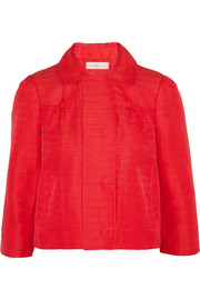
|
Spring Jacket
by Dolce&Gabbana |
Red | M | €549 |
1
|
€549 | |
| Total | €2,346 | ||||||
<div class="table-responsive">
<table class="table table-shopping">
<thead>
<tr>
<th class="text-center"></th>
<th >Product</th>
<th class="th-description">Color</th>
<th class="th-description">Size</th>
<th class="text-right">Price</th>
<th class="text-right">Qty</th>
<th class="text-right">Amount</th>
<th></th>
</tr>
</thead>
<tbody>
<tr>
<td>
<div class="img-container">
<img src="assets/img/product1.jpg" alt="...">
</div>
</td>
<td class="td-name">
<a href="#jacket">Spring Jacket</a>
<br /><small>by Dolce&Gabbana</small>
</td>
<td>
Red
</td>
<td>
M
</td>
<td class="td-number">
<small>€</small>549
</td>
<td class="td-number">
1
<div class="btn-group">
<button class="btn btn-round btn-info btn-xs"> <i class="material-icons">remove</i> </button>
<button class="btn btn-round btn-info btn-xs"> <i class="material-icons">add</i> </button>
</div>
</td>
<td class="td-number">
<small>€</small>549
</td>
<td class="td-actions">
<button type="button" rel="tooltip" data-placement="left" title="Remove item" class="btn">
<i class="material-icons">close</i>
</button>
</td>
</tr>
<tr>
<td colspan="3">
</td>
<td class="td-total">
Total
</td>
<td class="td-price">
<small>€</small>2,346
</td>
<td colspan="3" class="text-right"> <button type="button" class="btn btn-info btn-round btn-lg">Complete Purchase <i class="material-icons">keyboard_arrow_right</i></button></td>
</tr>
</tbody>
</table>
</div>
Bootstrap DateTimePicker v4.17.37
We have created the design of the date-time picker made by Eonasdan. We have changed the colors, typography and buttons, so it can look like the rest of the dashboard.
For more information please check Full Github Documentation.
Here is a coded example:
			<!-- input with datetimepicker -->
			<div class="form-group">
			    <label class="label-control">Datetime Picker</label>
			    <input type="text" class="form-control datetimepicker" value="10/05/2016"/>
			</div>

			<!-- javascript for init -->
			    $('.datetimepicker').datetimepicker({
			    icons: {
			        time: "fa fa-clock-o",
			        date: "fa fa-calendar",
			        up: "fa fa-chevron-up",
			        down: "fa fa-chevron-down",
			        previous: 'fa fa-chevron-left',
			        next: 'fa fa-chevron-right',
			        today: 'fa fa-screenshot',
			        clear: 'fa fa-trash',
			        close: 'fa fa-remove'
			    }
			});
Parallax
The parallax scrolling effect can be activated by simple putting data-parallax="true" , like in the below code. If you want to deactivate parallax, you have to change true value with false.
<div class="page-header header-filter clear-filter" data-parallax="true" style="background-image: url('assets/img/bg0.jpg');">
	<div class="container">
		<div class="row">
			<div class="col-md-8 col-md-offset-2">
				<div class="brand">
					<h1>Material Kit
						<div class="pro-badge">
							Pro
						</div>
					</h1>

					<h3 class="title">All Components</h3>
				</div>
			</div>
		</div>
	</div>
</div>
Modals
We restyled the classic Bootstrap Modal and gave it a more simple look. We have also created a special modal for alerts.
IMPORTANT! Please make sure you place the modal body outside of the div.wrapper tag.
<!-- classic modal -->
<button class="btn btn-primary btn-round" data-toggle="modal" data-target="#myModal">
    Classic modal
</button>

<div class="modal fade" id="myModal" tabindex="-1" role="dialog" aria-labelledby="myModalLabel" aria-hidden="true">
	<div class="modal-dialog">
		<div class="modal-content">
			<div class="modal-header">
				<button type="button" class="close" data-dismiss="modal" aria-hidden="true">
					<i class="material-icons">clear</i>
				</button>
				<h4 class="modal-title">Modal title</h4>
			</div>
			<div class="modal-body">
				<p>Far far away...
				</p>
			</div>
			<div class="modal-footer">
				<button type="button" class="btn btn-default btn-simple">Nice Button</button>
				<button type="button" class="btn btn-danger btn-simple" data-dismiss="modal">Close</button>
			</div>
		</div>
	</div>
</div>


<!-- small alert modal -->
<button class="btn btn-round btn-rose" data-toggle="modal" data-target="#smallAlertModal">
    Small alert modal
</button>

<div class="modal fade" id="smallAlertModal" tabindex="-1" role="dialog" aria-labelledby="myModalLabel" aria-hidden="true">
  <div class="modal-dialog modal-small ">
    <div class="modal-content">
      <div class="modal-header">
        <button type="button" class="close" data-dismiss="modal" aria-hidden="true"><i class="material-icons">clear</i></button>
      </div>
      <div class="modal-body text-center">
        <h5>Are you sure you want to do this? </h5>
      </div>
      <div class="modal-footer text-center">
        <button type="button" class="btn" data-dismiss="modal">Never mind</button>
        <button type="button" class="btn btn-success">Yes</button>
      </div>
    </div>
  </div>
</div>
Collapsable Groups
We restyled the classic collapsable group, to make it look more like the other elements in material kit.
<div class="panel-group" id="accordion" role="tablist" aria-multiselectable="true">
  <div class="panel panel-default">
    <div class="panel-heading" role="tab" id="headingOne">
        <a role="button" data-toggle="collapse" data-parent="#accordion" href="#collapseOne" aria-expanded="true" aria-controls="collapseOne">
            <h4 class="panel-title">
            Collapsible Group Item #1
            <i class="material-icons">keyboard_arrow_down</i>
            </h4>
        </a>
    </div>
    <div id="collapseOne" class="panel-collapse collapse in" role="tabpanel" aria-labelledby="headingOne">
      <div class="panel-body">
        Anim pariatur...
      </div>
    </div>
  </div>
  <div class="panel panel-default">
    <div class="panel-heading" role="tab" id="headingTwo">
      <a class="collapsed" role="button" data-toggle="collapse" data-parent="#accordion" href="#collapseTwo" aria-expanded="false" aria-controls="collapseTwo">
        <h4 class="panel-title">
          Collapsible Group Item #2
          <i class="material-icons">keyboard_arrow_down</i>
        </h4>
      </a>
    </div>
    <div id="collapseTwo" class="panel-collapse collapse" role="tabpanel" aria-labelledby="headingTwo">
      <div class="panel-body">
        Anim pariatur...
      </div>
    </div>
  </div>
</div>
Tooltips
We restyled the Bootstrap tooltip.
<!-- Markup -->
<button type="button" class="btn btn-default" data-toggle="tooltip" data-placement="top" title="Tooltip on top">Button with Tooltip</button>

<!-- Javascript -->
$('.btn-tooltip').tooltip();
Popovers
We restyled the Bootstrap popover to align it with the Material Design Concept.
See the following example:
<!-- markup -->

<button type="button" class="btn btn-default" data-toggle="popover" data-placement="top" title="Popover on top" data-content="Here will be some very useful information about his popover.">On top</button>


<!-- javascript -->

$('[data-toggle="popover"]').popover();
Material Icons
Through most of the examples in this kit, we have used the default Icons for the Material Design provided by Google.
face<i class="material-icons">face</i>
Notifications
The new notifications are looking fresh and clean. They go great with the navbar. For the following notification examples we used the .container-fluid class, so they will be fluid. Please use the class .container when you use them outside of the .wrapper so they will be aligned with the general page container.
<div class="alert alert-info">
<div class="container-fluid">
<div class="alert-icon">
<i class="material-icons">info_outline</i>
</div>
<button type="button" class="close" data-dismiss="alert" aria-label="Close">
<span aria-hidden="true"><i class="material-icons">clear</i></span>
</button>
<b>Info alert:</b> You've got some friends nearby, stop looking at your phone and find them...
</div>
</div>
<div class="alert alert-success">
<div class="container-fluid">
<div class="alert-icon">
<i class="material-icons">check</i>
</div>
<button type="button" class="close" data-dismiss="alert" aria-label="Close">
<span aria-hidden="true"><i class="material-icons">clear</i></span>
</button>
<b>Success Alert:</b> Yuhuuu! You've got your $11.99 album from The Weeknd
</div>
</div>
<div class="alert alert-warning">
<div class="container-fluid">
<div class="alert-icon">
<i class="material-icons">warning</i>
</div>
<button type="button" class="close" data-dismiss="alert" aria-label="Close">
<span aria-hidden="true"><i class="material-icons">clear</i></span>
</button>
<b>Warning Alert:</b> Hey, it looks like you still have the "copyright © 2015" in your footer. Please update it!
</div>
</div>
<div class="alert alert-danger">
<div class="container-fluid">
<div class="alert-icon">
<i class="material-icons">error_outline</i>
</div>
<button type="button" class="close" data-dismiss="alert" aria-label="Close">
<span aria-hidden="true"><i class="material-icons">clear</i></span>
</button>
<b>Error Alert:</b> Damn man! You screwed up the server this time. You should find a good excuse for your Boss...
</div>
</div>
Info Areas
The information areas are a simple way to organise large amounts of information into chunks. You can also add icons, simple or coloured. For an horizontal alignment use the custom class .info-horizontal. For the title, please use the class .info-title. You can see more illustrative examples below:
Free Chat
Divide details about your product or agency work into parts. Write a few lines about each one. A paragraph describing a feature will be enough.
Collaborate
The moment you use Material Kit, you know you’ve never felt anything like it. With a single use, this powerfull UI Kit lets you do more than ever before.
Find more...<div class="info"> <div class="icon icon-primary"> <i class="material-icons">chat</i> </div> <h4 class="info-title">Free Chat</h4> <p>Divide details about your product or agency work into parts. Write a few lines about each one. A paragraph describing a feature will be enough.</p> </div> <div class="info info-horizontal"> <div class="icon icon-rose"> <i class="material-icons">group_work</i> </div> <div class="description"> <h4 class="info-title">Collaborate</h4> <p>The moment you use Material Kit, you know you’ve never felt anything like it. With a single use, this powerfull UI Kit lets you do more than ever before. </p> <a href="#pablo">Find more...</a> </div> </div>
Cards
We have created a wide variety of cards. We think cards are one of the best ways to organise your information. We went all out with possibilities and we recommended finding the right fit for your product. The general class for a card is called .card. The information inside the card usually goes inside the content (class .card-content). The content can have three types of elements inside: .card-title, .description and .category. You can optionally add a .card-footer, if you want to place a call-to-action.
Blog Cards
If you are building a blog, these cards can be a good fit. Inside the section folder, you will find multiple variations for the blog cards: horizontal cards, vertical cards and big blog listings.
Here is a coded example of the vertical blog card.

Enterprise
Autodesk looks to future of 3D printing with Project Escher
Like so many organizations these days, Autodesk is a company in transition. It was until recently a traditional boxed software company selling licenses. Read More
<div class="card card-plain card-blog">
	<div class="card-image">
		<a href="#pablo">
			<img class="img img-raised" src="assets/img/examples/card-blog4.jpg" />
		</a>
	</div>

	<div class="card-content">
		<h6 class="category text-info">Enterprise</h6>
		<h4 class="card-title">
			<a href="#pablo">Autodesk looks to future of 3D printing with Project Escher</a>
		</h4>
		<p class="card-description">
			Like so many organizations these days, Autodesk is a company in transition. It was until recently a traditional boxed software company selling licenses.<a href="#pablo"> Read More </a>
		</p>
	</div>
</div>
Team Cards
If you want to present your team or you want to build cards for your users, we have created multiple options for cards. You can choose between round images and descriptions, or square images and description. You can also go with multiple background options, as you can see in the section page.
Here is a coded example of an user card with round image and description:
Rebecca Stormvile
Web Developer
Don't be scared of the truth because we need to restart the human foundation.
<div class="card card-profile card-plain">
	<div class="card-avatar">
		<a href="#pablo">
			<img class="img" src="assets/img/faces/avatar.jpg" />
		</a>
	</div>

	<div class="card-content">
		<h4 class="card-title">Rebecca Stormvile</h4>
		<h6 class="category text-muted">Web Developer</h6>

		<p class="card-description">
			Don't be scared of the truth because we need to restart the human foundation.
		</p>
		<div class="footer">
			<a href="#pablo" class="btn btn-just-icon btn-simple btn-google"><i class="fa fa-google"></i></a>
			<a href="#pablo" class="btn btn-just-icon btn-simple btn-twitter"><i class="fa fa-twitter"></i></a>
			<a href="#pablo" class="btn btn-just-icon btn-simple btn-dribbble"><i class="fa fa-dribbble"></i></a>
		</div>
	</div>
</div>
Project Cards
If you are building a landing page and want to showcase your projects, or if you want to enlist your products these cards are a good option. You have multiple options to choose from: cards with image backgrounds, square images and text or square images and features.
Here is an example of a project card with square image and text.

Light Bootstrap Dashboard
Premium Template
Light Bootstrap Dashboard PRO is a Bootstrap Admin Theme designed to look simple and beautiful. Forget about boring dashboards and grab yourself a copy to kickstart new project!
<div class="card card-plain">
	<a href="https://www.creative-tim.com/product/light-bootstrap-dashboard-pro" target="_blank">
		<div class="card-image">
			<img src="https://s3.amazonaws.com/creativetim_bucket/products/34/original/opt_lbd_pro_new_thumbnail.jpg?1449352503" />
		</div>
	</a>
	<div class="card-content">

		<a href="https://www.creative-tim.com/product/light-bootstrap-dashboard-pro" target="_blank">
			<h4 class="card-title">Light Bootstrap Dashboard</h4>
		</a>
		<h6 class="category">Premium Template</h6>
		<p class="card-description">
			Light Bootstrap Dashboard PRO is a Bootstrap Admin Theme designed to look simple and beautiful. Forget about boring dashboards and grab yourself a copy to kickstart new project!
		</p>
	</div>
</div>
Pricing Cards
If you are building a subscription-based application or if you have a multiple-plan service, you can use the pricing cards. You can choose between pricing cards with icons, with numbers or with coloured background.
Here is an example of a pricing card with icon.
<div class="card card-pricing card-raised">
	<div class="card-content">
		<h6 class="category">Small Company</h6>
		<div class="icon icon-rose">
			<i class="material-icons">home</i>
		</div>
		<h3 class="card-title">$29</h3>
		<p class="card-description">
			This is good if your company size is between 2 and 10 Persons.
		</p>
		<a href="#pablo" class="btn btn-rose btn-round">Choose Plan</a>
	</div>
</div>
Rotating Cards
If you have too much content on one card or if you want to add some extra actions like share, tweet etc. you can use now that back of the cards. The rotating cards need the class .rotating-card-container for the element that it will rotate. The card need to have the class .card-rotate.
You can trigger the card on :hover state or manual using the class .manual-flip in combination with a button .btn-rotate which will basically rotate the card or the image from the card.
More examples can be found here:
Full Background Card
This Background Card Will Rotate on Hover
Don't be scared of the truth because we need to restart the human foundation in truth And I love you like Kanye loves Kanye I love Rick Owens’ bed design but the back is...
Manage Post
As an Admin, you have shortcuts to edit, view or delete the posts.
Manual Rotating Card
"This card is doing a full rotation, click on the rotate button"
Don't be scared of the truth because we need to restart the human foundation in truth And I love you like Kanye loves Kanye I love Rick Owens’ bed design but the back is...
Do more...
You can read this article or share it with your friends and family on different networks...
// Hover Rotating Card

<div class="rotating-card-container" style="height: 302px; margin-bottom: 30px;">
	<div class="card card-rotate card-background">
		<div class="front front-background" style="background-image: url('assets/img/examples/card-blog5.jpg');">
			<div class="card-content">
				<h6 class="category text-info">Full Background Card</h6>
				<a href="#pablo">
					<h3 class="card-title">This Background Card Will Rotate on Hover</h3>
				</a>
				<p class="card-description">
					Don't be scared of the truth because we need to restart the human foundation in truth And I love you like Kanye loves Kanye I love Rick Owens’ bed design but the back is...
				</p>
			</div>
		</div>

		<div class="back back-background" style="background-image: url('assets/img/examples/card-blog5.jpg');">
			<div class="card-content">
				<h5 class="card-title">
					Manage Post
				</h5>
				<p class="card-description">As an Admin, you have shortcuts to edit, view or delete the posts.</p>
				<div class="footer text-center">
					<a href="#pablo" class="btn btn-info btn-just-icon btn-fill btn-round">
						<i class="material-icons">subject</i>
					</a>
					<a href="#pablo" class="btn btn-success btn-just-icon btn-fill btn-round btn-wd">
						<i class="material-icons">mode_edit</i>
					</a>
					<a href="#pablo" class="btn btn-danger btn-just-icon btn-fill btn-round">
						<i class="material-icons">delete</i>
					</a>
				</div>
			</div>
		</div>
	</div>
</div>

// Manual Rotating Card

<div class="rotating-card-container manual-flip">
	<div class="card card-rotate">
		<div class="front">
			<div class="card-content">
				<h5 class="category-social text-success">
					<i class="fa fa-newspaper-o"></i> Manual Rotating Card
				</h5>
				<h4 class="card-title">
					<a href="#pablo">"This card is doing a full rotation, click on the rotate button"</a>
				</h4>
				<p class="card-description">
					Don't be scared of the truth because we need to restart the human foundation in truth And I love you like Kanye loves Kanye I love Rick Owens’ bed design but the back is...
				</p>
				<div class="footer text-center">
					<button type="button" name="button" class="btn btn-success btn-fill btn-round btn-rotate">
						<i class="material-icons">refresh</i> Rotate...
					</button>
				</div>
			</div>
		</div>

		<div class="back">
			<div class="card-content">
				<br>
				<h5 class="card-title">
					Do more...
				</h5>
				<p class="card-description">
					You can read this article or share it with your friends and family on different networks...
				</p>
				<div class="footer text-center">
					<a href="#pablo" class="btn btn-rose btn-round">
						<i class="material-icons">subject</i> Read
					</a>
					<a href="#pablo" class="btn btn-just-icon btn-round btn-twitter">
						<i class="fa fa-twitter"></i>
					</a>
					<a href="#pablo" class="btn btn-just-icon btn-round btn-dribbble">
						<i class="fa fa-dribbble"></i>
					</a>
					<a href="#pablo" class="btn btn-just-icon btn-round btn-facebook">
						<i class="fa fa-facebook"></i>
					</a>
				</div>
				<br>
				<button type="button" name="button" class="btn btn-simple btn-round btn-rotate">
					<i class="material-icons">refresh</i> Back...
				</button>

			</div>
		</div>

	</div>
</div>
How to setup Google API Keys
-
Go to https://developers.google.com/maps/documentation/javascript/get-api-key
Scroll to the “Get an API key” Title and press the “Get a Key” Button
Choose a name for your project then press on Create and Enable API
Get the Key and place it in your project where is this script:
<script type="text/javascript" src="https://maps.googleapis.com/maps/api/js?key=YOUR_KEY_HERE"></script>
Sections & Main
We have created multiple options for the background of sections. You can go with a white, gray or black colour or with a coloured gradient. To see how they look and what class you need to use for them, you can check them out below.
All the components are locate inside a div with class .main. It is white with a relative position. If you want to have the main area "raised" and get the Page effect for your content you need to add the .main-raised class to it.
Changing Colors (SASS)
You can change the default colors via variables from SASS:
- You can find the colors in assets/sass/material-kit/_variables.scss starting with line 28 where is the primary color set:
$brand-primary: $purple !default;. All the possible colors are in assets/sass/material-kit/_colors.scss - Add the SASS folder from
assets/sass/to a new project inside Koala Compiler and find the file material-kit.scss, it will be the one in Green. - Right click on that file and set the output path, it must be in
assets/css/so anything that you compile will overwrite the original material-kit.min.css - Press on compile and everything will be done automatically.
Moving Components
If you want to move components from Kit to Dashboard, just follow the next steps:
- You can got to material-kit/assets/sass/material-kit/_fileupload.scss and put it in the same folder structure to material-dashboard.
- Compile again the assets/sass/material-dashboard.scss SASS using Koala href="https://koala-app.com/" target="_blank">Koala App (make sure you set the output path to assets/css/material-dashboard.css).
- Move the library for the file upload from material-kit/assets/js/jasny-bootstrap.min.js to the same folder in material-dashboard and then everything should work fine in the Dashboard.