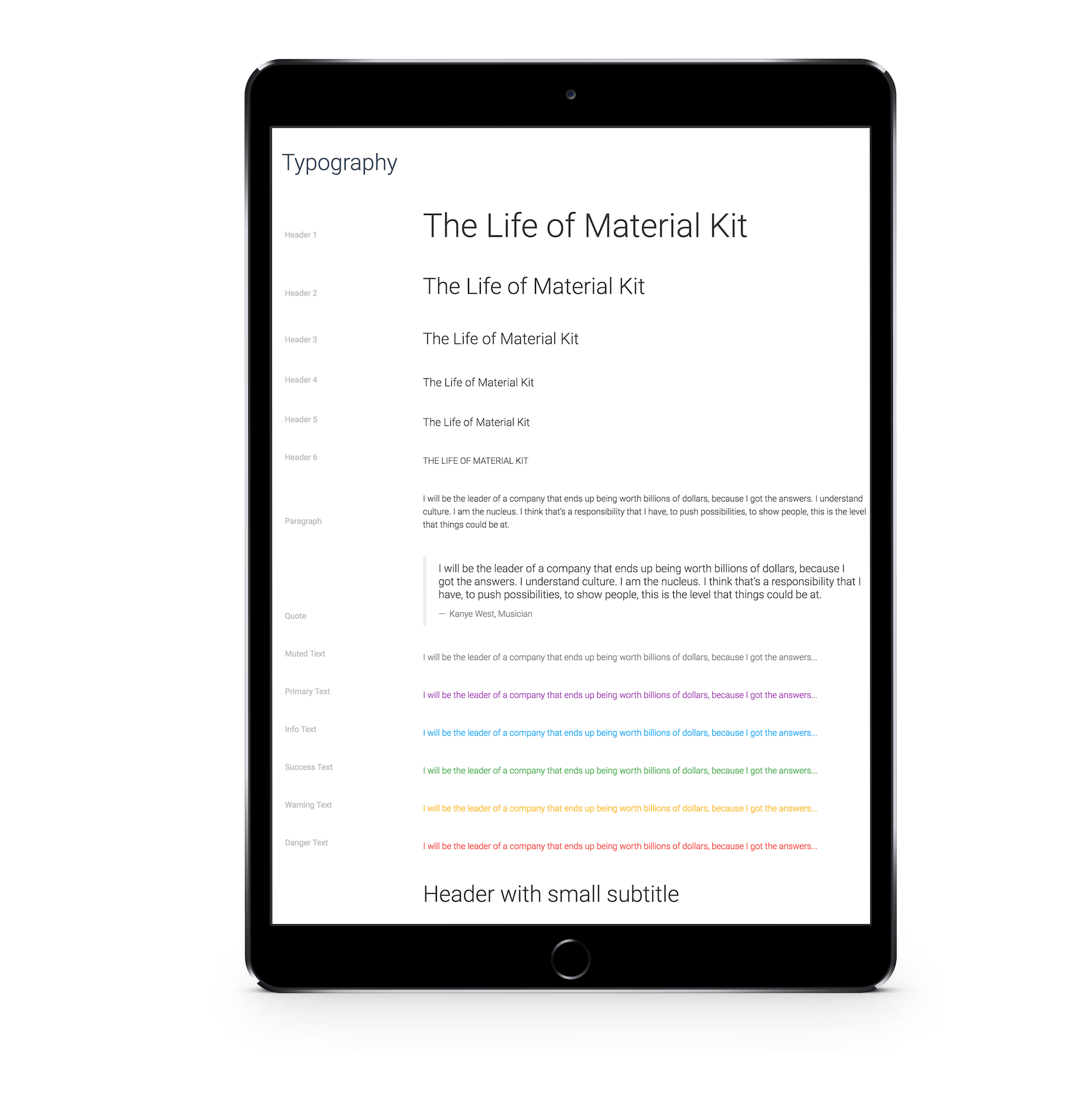
Easily accessible web fonts are used throughout the Material kit.
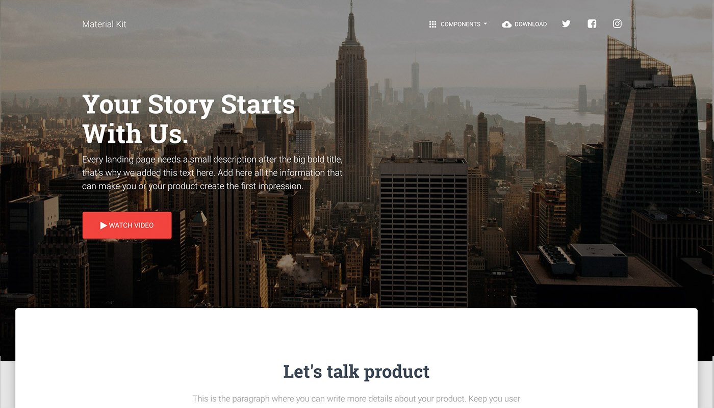
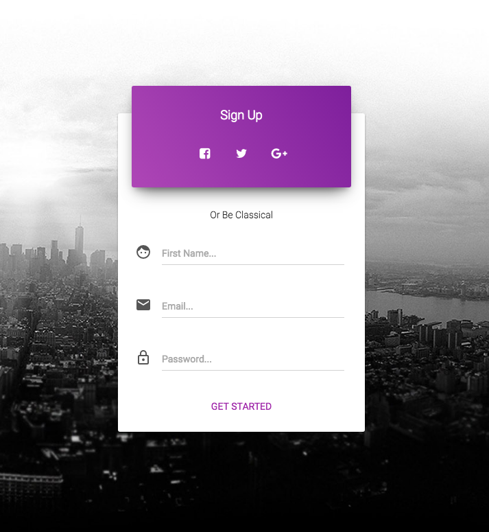
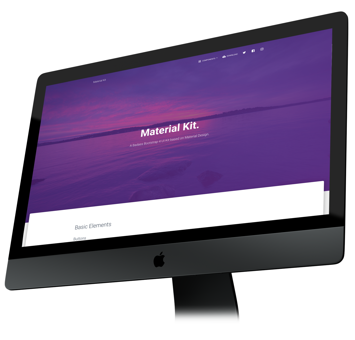
Materiak Kit has a fresh design inspired by Google's Material Design.
Regardless of the screen size, the website content will naturally fit the given resolution.
Enjoy the fluid grid system based on 12 columns used in the popular Bootstrap framework.


It is built over Bootstrap 4, it's fully responsive and has all the benefits of the flexbox for the layout, grid system and components. This is a huge advantage when you work with columns.
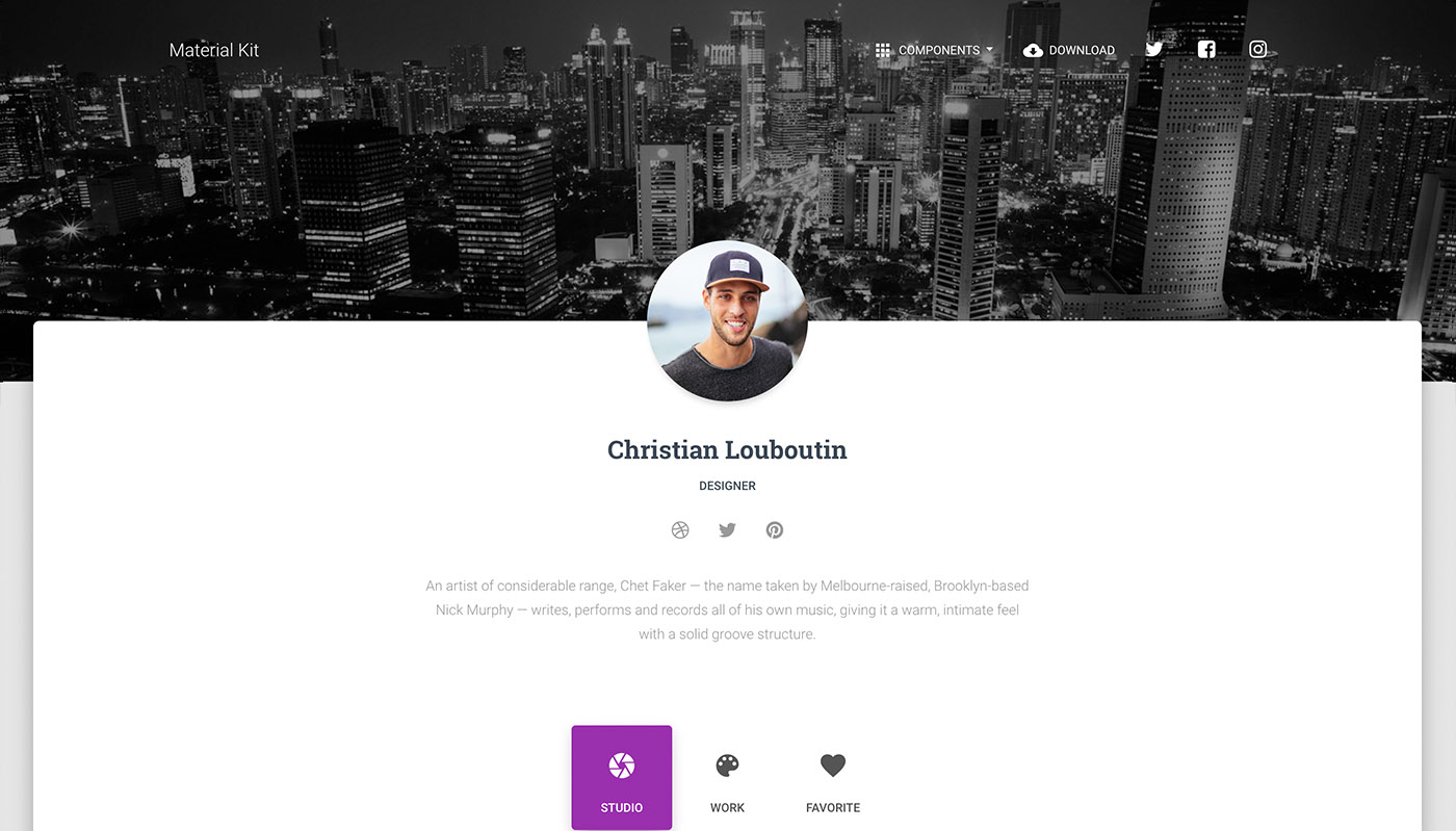
Divide details about your product or agency work into parts. Write a few lines about each one. A paragraph describing a feature will be enough.
Using the Material Kit will save you large amount of time. You don't have to worry about creating new elements of design, you just take care of the development.