Best stories
This is a simple card
Cards are an interaction model...
We worked over the original Bootstrap classes, choosing a different colour palette. We opted for this beautiful scheme of pale colours:
Buttons come in all needed sizes:
We added extra classes that can help you better customise the look. You can use regular buttons, filled buttons or plain link buttons. Let's see some examples:
Button groups, toolbars, and disabled states all work like they are supposed to.
An extra category of buttons that are necessary for any project is the social buttons. We have added classes that provide the default colour for every social network.
To use them, you have to add to your button the general class 'btn-icon' and the specific network, for example 'btn-twitter'. All styles described above can be applied to social buttons, ranging from filled to round to simple.
We used the Font Awesome social icons that you can find here.
Here is the example for all the social buttons with the filled style:
We also created a set of classes that add animations to the buttons, when you hover over them. You can choose between 'btn-rotate', which slightly rotates the icon inside the button, 'btn-magnify', which increases the size of an icon inside the button and 'btn-move-right', 'btn-move-left' that make the icon go left or right.
Here is the example with all the animated buttons designed with filled style:
To use the custom checkboxes, you need to import a separate Javascript file called 'ct-paper-checkbox.js'.
Usage can be done via Data Attributes: See example.
    <label class="checkbox" for="checkbox1">

        <input type="checkbox" value="" id="checkbox1" data-toggle="checkbox">

        Unchecked

    </label>

    <label class="checkbox" for="checkbox2">

        <input type="checkbox" value="" id="checkbox2" data-toggle="checkbox" checked>

        Checked

    </label>

    <label class="checkbox" for="checkbox3">

        <input type="checkbox" value="" id="checkbox3" data-toggle="checkbox" disabled>

        Disabled unchecked

    </label>

    <label class="checkbox" for="checkbox4">

        <input type="checkbox" value="" id="checkbox4" data-toggle="checkbox" disabled checked>

        Disabled checked

    </label>
Or can be called via Javascript: See example.
$(':checkbox').checkbox();
We added more classes to provide you with choices.
    <label class="checkbox checkbox-blue" for="checkbox1">

        <input type="checkbox" value="" id="checkbox1" data-toggle="checkbox" checked>

        Blue

    </label>

    <label class="checkbox checkbox-azure" for="checkbox2">

        <input type="checkbox" value="" id="checkbox2" data-toggle="checkbox" checked>

        Azure

    </label>

    <label class="checkbox checkbox-green" for="checkbox3">

        <input type="checkbox" value="" id="checkbox3" data-toggle="checkbox" checked>

        Green

    </label>

    <label class="checkbox checkbox-orange" for="checkbox4">

        <input type="checkbox" value="" id="checkbox4" data-toggle="checkbox" checked>

        Orange

    </label>

    <label class="checkbox checkbox-red" for="checkbox5">

        <input type="checkbox" value="" id="checkbox5" data-toggle="checkbox" checked>

        Red

    </label>
$(':checkbox').checkbox('check');
    $(':checkbox').on('toggle', function() {
      // Do something
    });
To use the custom radio buttons, you need to import a separate Javascript file called 'ct-paper-radio.js'.
Usage can be done via Data Attributes: See example.
    <label class="radio">

        <input type="radio" name="optionsRadios" data-toggle="radio" id="optionsRadios1" value="option1">

        <i></i>Radio is off

    </label>

    <label class="radio">

        <input type="radio" name="optionsRadios" data-toggle="radio" id="optionsRadios2" value="option1" checked>

        <i></i>Radio is on

    </label>

    <label class="radio">

        <input type="radio" name="optionsRadiosDisabled" data-toggle="radio" id="optionsRadios3" value="option2" disabled>

        <i></i>Disabled radio is off

    </label>

    <label class="radio">

        <input type="radio" name="optionsRadiosDisabled" data-toggle="radio" id="optionsRadios4" value="option2" checked disabled>

        <i></i>Disabled radio is on

    </label>
Or it can be called via Javascript: See example.
$(':radio').radio();
You can choose between different colours:
    <label class="radio radio-blue">

        <input type="radio" name="optionsRadios1" data-toggle="radio" id="optionsRadios1" value="option1" checked>

        <i></i>Blue

    </label>

    <label class="radio radio-azure">

        <input type="radio" name="optionsRadios2" data-toggle="radio" id="optionsRadios2" value="option1" checked>

        <i></i>Azure

    </label>

    <label class="radio radio-green">

        <input type="radio" name="optionsRadios3" data-toggle="radio" id="optionsRadios3" value="option1" checked>

        <i></i>Green

    </label>

    <label class="radio radio-orange">

        <input type="radio" name="optionsRadios4" data-toggle="radio" id="optionsRadios4" value="option1" checked>

        <i></i>Orange

    </label>

    <label class="radio radio-red">

        <input type="radio" name="optionsRadios5" data-toggle="radio" id="optionsRadios5" value="option1" checked>

        <i></i>Red

    </label>
$(':radio').radio('check');
    $(':radio').on('toggle', function() {
      // Do something
    });
We restyled the Bootstrap input to give it a different look. You can use the classic look, different colours and states or input groups. The default style for inputs is without borders, but if the colour inside the input is too close to your background, you can add the class 'border-input' to add a border to the input. If you want the input group to have a border, you should add the class 'border-input' both to the group and to the input.
    <div class="form-group">

        <input type="text" value="" placeholder="Input" class="form-control border-input" />

    </div>


    <div class="form-group has-success">

        <input type="text" value="Success" class="form-control" />

    </div>


    <div class="form-group has-error has-feedback">

        <input type="text" value="Error" class="form-control" />

        <span class="glyphicon glyphicon-remove form-control-feedback"></span>

    </div>


    <div class="input-group border-input">

        <input type="text" value="Group Addon" class="form-control border-input">

        <span class="input-group-addon"><i class="fa fa-group"></i></span>

    </div>
We added custom style for the textarea, so it looks similar to all other inputs. The textarea can also have the class 'border-input', if it blends into the background.
We have also created a special textarea if you want to limit the user input to a number of characters. You can see the implementation below.
<!-- textarea with border -->
<textarea class="form-control border-input" placeholder="This is a textarea with border. Here can be your nice text" rows="3"></textarea>

<!-- textarea with limitations -->
<textarea class="form-control textarea-limited border-input" placeholder="This is a textarea limited to 150 characters." rows="3", data-limit="150" ></textarea>
<h5><small><span id="textarea-limited-message" class="pull-right">150 characters left</span></small></h5>
// Limit number of characters in limited textarea
$('.textarea-limited').keyup(function () {
  var max = $(this).data('limit');
  var len = $(this).val().length;
  if (len >= max) {
    $('#textarea-limited-message').text(' you have reached the limit');
  } else {
    var char = max - len;
    $('#textarea-limited-message').text(char + ' characters left');
  }
});
We are very proud to present the dropdown, we added a subtle animation resembling a piece of paper sliding down. If you want the hover colour to vary, you can choose any of the classes 'dropdown-primary', 'dropdown-info', 'dropdown-success', 'dropdown-warning', 'dropdown-danger'. We have also added 2 more special dropdowns: one for notifications and a small one for showing messages when you have finished reading the notifications. Here is the examples and the code:
Notifications · 0 Notifications · 7
<span class="dropdown">
<button href="#" class="dropdown-toggle btn btn-primary" data-toggle="dropdown">Primary <b class="caret"></b></button>
<!-- You can add classes for different colours on the next element -->
<ul class="dropdown-menu dropdown-primary dropdown-menu-right">
<li class="dropdown-header">Dropdown header</li>
<li><a href="#">Action</a></li>
<li><a href="#">Another action</a></li>
<li><a href="#">Something else here</a></li>
<li class="divider"></li>
<li><a href="#">Separated link</a></li>
<li class="divider"></li>
<li><a href="#">One more separated link</a></li>
</ul>
</span>
<span class="dropdown">
<a class="btn btn-icon btn-warning btn-fill" data-toggle="dropdown">
Notifications · 0
</a>
<ul class="dropdown-menu dropdown-menu-right dropdown-notification">
<li class="no-notification">
You're all clear!
</li>
</ul>
</span>
<span class="dropdown">
<a class="btn btn-sm btn-danger btn-fill" data-toggle="dropdown">
7
</a>
<ul class="dropdown-menu dropdown-menu-right dropdown-wide dropdown-notification">
<li class="dropdown-header">
You have 7 unread notifications
</li>
<li>
<ul class="dropdown-notification-list scroll-area">
<li>
<a href="#" class="notification-item">
<div class="notification-text">
<span class="label label-icon label-success"><i class="ti-comment-alt"></i></span>
<span class="message"><b>Patrick</b> mentioned you in a comment.</span>
<br />
<span class="time">20min ago</span>
<button class="btn btn-xs btn-icon btn-fill read-notification">
<i class="ti-check"></i>
</button>
</div>
</a>
</li>
<!-- end scroll area -->
<li class="dropdown-footer">
<ul class="dropdown-footer-menu">
<li>
<a href="#">Mark all as read</a>
</li>
</ul>
</li>
</ul>
</span>
We restyled the dropup and added special classes for sharing and actions. You can see them below with the full implementation.
<!-- dropup with sharing -->
<div class="dropup">
  <button id="dLabel" type="button" class="btn btn-block btn-fill" data-toggle="dropdown" aria-haspopup="true" aria-expanded="false">
    Sharing
  </button>
  <ul class="dropdown-menu dropdown-sharing dropdown-menu-right dropdown-medium" aria-labelledby="dLabel">
        <li class="dropdown-header text-center">Sharing is caring!</li>
        <li>
            <div class="social-line">
                <div class="row">
                    <div class="col-xs-2">
                        <span class="icon-twitter"><i class="ti-twitter-alt"></i></span>
                    </div>
                    <div class="col-xs-6">Twitter</div>
                    <div class="col-xs-4">
                        <div class="switch"
                          data-on-label="<i class='ti-check'></i>"
                          data-off-label="<i class='ti-close'></i>">
                          <input type="checkbox" checked class="ct-success"/>
                        </div>
                    </div>
                </div>
            </div>
        </li>
        <li class="divider"></li>
        <li>
            <div class="social-line">
                <div class="row">
                    <div class="col-xs-2">
                        <span class="icon-facebook"><i class="ti-facebook"></i></span>
                    </div>
                    <div class="col-xs-6">Facebook</div>
                    <div class="col-xs-4">
                        <div class="switch"
                          data-on-label="<i class='ti-check'></i>"
                          data-off-label="<i class='ti-close'></i>">
                          <input type="checkbox" class="ct-success"/>
                        </div>
                    </div>
                </div>
            </div>
        </li>
        <li class="divider"></li>
        <li>
            <div class="social-line">
                <div class="row">
                    <div class="col-xs-2">
                        <span class="icon-pinterest"><i class="ti-pinterest"></i></span>
                    </div>
                    <div class="col-xs-6">Pinterest</div>
                    <div class="col-xs-4">
                        <div class="switch"
                          data-on-label="<i class='ti-check'></i>"
                          data-off-label="<i class='ti-close'></i>">
                          <input type="checkbox" class="ct-success"/>
                        </div>
                    </div>
                </div>
            </div>
        </li>
        <li><a href="#">
            <button class="btn btn-block btn-fill btn-info">Share</button>

        </a></li>
  </ul>
</div>

<!-- dropdown with actions -->
<div class="dropup">
  <button id="dLabel" type="button" class="btn btn-block btn-fill" data-toggle="dropdown" aria-haspopup="true" aria-expanded="false">
    Actions
  </button>
  <ul class="dropdown-menu dropdown-actions dropdown-menu-right dropdown-medium" aria-labelledby="dLabel">
        <li>
            <a href="#" class="action-line">
                <div class="row">
                    <div class="col-xs-2">
                        <span class="icon-simple"><i class="ti-files"></i></span>
                    </div>
                    <div class="col-xs-9">Duplicate</div>
                </div>
            </a>
        </li>
        <li class="divider"></li>
        <li>
            <a href="#" class="action-line">
                <div class="row">
                    <div class="col-xs-2">
                        <span class="icon-simple"><i class="ti-move"></i></span>
                    </div>
                    <div class="col-xs-9">Move</div>
                </div>
            </a>
        </li>
        <li class="divider"></li>
        <li>
            <a href="#" class="action-line link-danger">
                <div class="row">
                    <div class="col-xs-2">
                        <span class="icon-simple"><i class="ti-archive"></i></span>
                    </div>
                    <div class="col-xs-9">Archive</div>
                </div>
            </a>
        </li>
  </ul>
</div>
We added new style classes for the dropdown; to use them you have to add the class "dropdown-{primary/info/success/warning.danger}" with the colour you want. There are 2 ways to use them: as normal select, in which case you need to specify the style as "form-control", or as button, for which you have to specify the style as "btn-{type}".
    <select name="huge" class="selectpicker" data-style="form-control" data-menu-style="">

        <option disabled selected> Choose city</option>

        <option value="1">Paris </option>

        <option value="1">Bucharest</option>

    </select>


    <select name="huge" class="selectpicker" data-style="btn-info btn-fill btn-block" data-menu-style="dropdown-blue">

        <option disabled selected> Choose city</option>

        <option value="1">Paris </option>

        <option value="1">Bucharest</option>

    </select>
If you want to use something more special than a checkbox, we recommend the switch. You can use it with both text and with icons. For extra customisation we added colour classes.
For the original documentation, please go here: Larentis Switch.
    <input type="checkbox" checked data-toggle="switch" class="ct-green"/>

    <input type="checkbox" data-toggle="switch" />


    <div class="switch"

      data-on-label="<i class='fa fa-check'></i>"

      data-off-label="<i class='fa fa-times'></i>">

      <input type="checkbox" checked/>

    </div>

    <div class="switch"

      data-on-label="<i class='fa fa-check'></i>"

      data-off-label="<i class='fa fa-times'></i>">

      <input type="checkbox"/>

    </div>
We restyled the default options for labels.
Default Primary Success Info Warning Danger
    <span class="label label-default">Default</span>

    <span class="label label-primary">Primary</span>

    <span class="label label-success">Success</span>

    <span class="label label-info">Info</span>

    <span class="label label-warning">Warning</span>

    <span class="label label-danger">Danger</span>
We added multiple pre-loaders that move indefinitely. You can use them as stand-alone, add a background to them or place them inside an element, like a button. There are 2 sizes you can use: the default one is the bigger option, and to shrink it, you can add the class 'reload-small'.
Here are the options and the implementation for them.
<div class='uil-reload-css' style=''><div></div></div>
<div class='uil-reload-css reload-small' style=''><div></div></div>

<div class='uil-reload-css reload-background' style=''><div></div></div>
<div class='uil-reload-css reload-background reload-small' style=''><div></div></div>

<a href="#" class="btn btn-fill"><div class='uil-reload-css reload-small' style=''><div></div></div> Something</a>
To speed up the creation of a webpage, we created multiple options for the header area. You can try a header with an image and a filter (black or coloured), you can add a live photo or a video.
See more examples and implementation here.
Set up a space on your page to gather subscriptions by adding this special area. It contains the email input and a call to action (you can use any variation of button you see fit). The subscription area comes with 3 styles: white (class "subscribe-line"), black (class "subscribe-line-black") and transparent (class "subscribe-line-transparent"), which looks best when you use a background image and a black layer over it.
See the examples and implementation here.
Promote sharing in your site by adding the kit's custom social lines. You can add your own text, the buttons are the social ones (you can find them in the Social Buttons section). There are 2 variations for the social line: white (by using the class "social line" ) and black (by using the class "social-line-black").
See more examples and implementation here.
The information areas are a simple way to organise large amounts of information into chunks. You can also add icons, simple or coloured. For an horizontal alignment use the custom class "icon-horizontal". See more illustrative examples below:
Spend your time generating new ideas. You don't have to think of implementing anymore.
Spend your time generating new ideas. You don't have to think of implementing anymore.
See more
<!-- info area with orange icon -->
<div class="info">
    <div class="icon icon-danger">
        <i class="ti-brush-alt"></i>
    </div>
    <div class="description">
        <h4> Save Time </h4>
        <p>Spend your time generating new ideas. You don't have to think of implementing anymore.</p>
    </div>
</div>

<!-- horizontal info area with blue icon -->
<div class="info info-horizontal">
    <div class="icon icon-info">
        <i class="ti-gallery"></i>
    </div>
    <div class="description">
        <h4> Beautiful Gallery </h4>
        <p>Spend your time generating new ideas. You don't have to think of implementing anymore.</p>
        <a href="#" class="btn btn-simple btn-info">See more</a>
    </div>
</div>
We took the Bootstrap pagination elements and customised them to fit the overall theme.
Besides the classic look, we also added the colour classes to offer more customisation.
<ul class="pagination">
<li><a href="#">«</a></li>
<li><a href="#">1</a></li>
<li><a href="#">2</a></li>
<li class="active"><a href="#">3</a></li>
<li><a href="#">4</a></li>
<li><a href="#">5</a></li>
<li><a href="#">»</a></li>
</ul>
The progress bars from Bootstrap hold the same classes and functionality. You can use the standard class or you can add the class 'progress-thin' for a progress bar that has only half the height of the normal one.
    <div class="progress">

      <div class="progress-bar" role="progressbar" aria-valuenow="60" aria-valuemin="0" aria-valuemax="100" style="width: 30%;">

        <span class="sr-only">60% Complete</span>

      </div>

    </div>

    <div class="progress">

      <div class="progress-bar progress-bar-info" role="progressbar" aria-valuenow="60" aria-valuemin="0" aria-valuemax="100" style="width: 60%;">

        <span class="sr-only">60% Complete</span>

      </div>

    </div>

    <div class="progress">

      <div class="progress-bar progress-bar-success" style="width: 35%">

        <span class="sr-only">35% Complete (success)</span>

      </div>

      <div class="progress-bar progress-bar-warning" style="width: 20%">

        <span class="sr-only">20% Complete (warning)</span>

      </div>

      <div class="progress-bar progress-bar-danger" style="width: 10%">

        <span class="sr-only">10% Complete (danger)</span>

      </div>

    </div>
The new Paper Kit notifications are looking fresh and clean. We have also added the possibility to place an icon inside the notification. They go great with the navbar. If you want to see how we recommend using them, you can see them here.
We restyled jQuery UI slider, while keeping the design consistent.
    <!-- Markup -->
    <div id="slider-default" class="slider-info"></div>

    <div id="slider-range" class="slider-success"></div>

    <!-- Javascript -->
    $( "#slider-range" ).slider({

    	range: true,
    	min: 0,
    	max: 500,
    	values: [ 75, 300 ],

    });

    $( "#slider-default" ).slider({

    		value: 70,
    		orientation: "horizontal",
    		range: "min",
    		animate: true

    });
All Boostrap classes for tables are supported and improved. Besides the simple and striped tables, we added a shopping cart table, that gives you more customisation. With the shopping cart table you can use the classes “td-name” for a cell that contains names and “td-number” for numbers. All tables have to possibility to add action cells for every row. You should add the class “td-actions” for the cell that has the actions.
If you want to make the most out of the Paper Kit tables, you should check out the next examples.
| # | Name | Job Position | Since | Salary | Actions |
|---|---|---|---|---|---|
| 1 | Andrew Mike | Develop | 2013 | € 99,225 | |
| 2 | John Doe | Design | 2012 | € 89,241 | |
| 3 | Alex Mike | Design | 2010 | € 92,144 |
<div class="table-responsive">
<table class="table">
<thead>
<tr>
<th class="text-center">#</th>
<th>Name</th>
<th>Job Position</th>
<th>Since</th>
<th class="text-right">Salary</th>
<th class="text-right">Actions</th>
</tr>
</thead>
<tbody>
<tr>
<td class="text-center">1</td>
<td>Andrew Mike</td>
<td>Develop</td>
<td>2013</td>
<td class="text-right">€ 99,225</td>
<td class="td-actions text-right">
<button type="button" rel="tooltip" title="View Profile" class="btn btn-info btn-simple btn-sm">
<i class="fa fa-user"></i>
</button>
<button type="button" rel="tooltip" title="Edit Profile" class="btn btn-success btn-simple btn-sm">
<i class="fa fa-edit"></i>
</button>
<button type="button" rel="tooltip" title="Remove" class="btn btn-danger btn-simple btn-sm">
<i class="fa fa-times"></i>
</button>
</td>
</tr>
</tbody>
</table>
</div>
| Price | Quantity | Total | ||
|---|---|---|---|---|

|
Get Shit Done Notebook
Most beautiful agenda for the office. |
€49 |
1
|
€49 |
| Total | €12,999 | |||
<div class="table-responsive">
<table class="table table-shopping">
<thead>
<tr>
<th class="text-center"></th>
<th></th>
<th class="text-right">Price</th>
<th class="text-right">Quantity</th>
<th class="text-right">Total</th>
</tr>
</thead>
<tbody>
<tr>
<td>
<div class="img-container">
<img src="assets/img/tables/agenda.png" alt="Agenda">
</div>
</td>
<td class="td-product">
<strong>Get Shit Done Notebook</strong>
<p>
Most beautiful agenda for the office.</p>
</td>
<td class="td-price">
<small>€</small>49
</td>
<td class="td-number td-quantity">
1
<div class="btn-group">
<button class="btn btn-sm"> - </button>
<button class="btn btn-sm"> + </button>
</div>
</td>
<td class="td-number">
<small>€</small>49
</td>
</tr>
<tr>
<td colspan="2"></td>
<td></td>
<td class="td-total">
Total
</td>
<td class="td-total">
<small>€</small>12,999
</td>
</tr>
<tr class="tr-actions">
<td colspan="3"></td>
<td colspan="2" class="text-right">
<button type="button" class="btn btn-danger btn-fill btn-lg">Complete Purchase <i class="fa fa-chevron-right"></i></button>
</td>
</tr>
</tbody>
</table>
</div>
For the comments section, we used the Bootstrap classes for media, to which we added the "media-post" class. You can use the former class for the area in which a user can post a comment.
All comments should be placed in the class "media-area". There is also a class for smaller comments area called “media-area-small”; use it for a tighter space, it will shrink the text and pictures.
You can see more examples here.
We restyled the classic Twitter Bootstrap modal and gave it a more simple look. To have the footer split into 2 parts, please use the 'left-side' and 'right-side' classes. You can see an example below.
<div class="modal fade" id="myModal" tabindex="-1" role="dialog" aria-labelledby="myModalLabel" aria-hidden="true">
<div class="modal-dialog">
<div class="modal-content">
<div class="modal-header">
<button type="button" class="close" data-dismiss="modal" aria-hidden="true">×</button>
<h4 class="modal-title" id="myModalLabel">Modal title</h4>
</div>
<div class="modal-body">
Far far away, behind the word mountains, far from the countries Vokalia and Consonantia, there live the blind texts. Separated they live in Bookmarksgrove right at the coast of the Semantics, a large language ocean. A small river named Duden flows by their place and supplies it with the necessary regelialia. It is a paradisematic country, in which roasted parts of sentences fly into your mouth. Even the all-powerful Pointing has no control about the blind texts it is an almost unorthographic life One day however a small line of blind text by the name of Lorem Ipsum decided to leave for the far World of Grammar.
</div>
<div class="modal-footer">
<div class="left-side">
<button type="button" class="btn btn-default btn-simple" data-dismiss="modal">Never mind</button>
</div>
<div class="divider"></div>
<div class="right-side">
<button type="button" class="btn btn-danger btn-simple">Delete</button>
</div>
</div>
</div>
</div>
</div>
We restyled the classic collapsable group, to make it look more like the other elements in paper kit. If you want to add a border for the panel, you can add the class 'panel-border'.
<div id="acordeon">
    <div class="panel-group" id="accordion">
      <div class="panel panel-border panel-default">
        <a data-toggle="collapse" href="#collapseOne">
            <div class="panel-heading">
              <h4 class="panel-title">
                  Default Collapsible Item 1
                  <i class="ti-angle-down"></i>
              </h4>

            </div>
        </a>
        <div id="collapseOne" class="panel-collapse collapse">
          <div class="panel-body">
            Anim...
          </div>
        </div>
      </div>
      <div class="panel panel-border panel-default">
        <a data-toggle="collapse" href="#collapseTwo">
            <div class="panel-heading">
              <h4 class="panel-title">
                  Default Collapsible Item 1
                  <i class="ti-angle-down"></i>
              </h4>

            </div>
        </a>
        <div id="collapseTwo" class="panel-collapse collapse">
          <div class="panel-body">
            Anim...
          </div>
        </div>
      </div>
      <div class="panel panel-border panel-default">
        <a data-toggle="collapse" href="#collapseThree">
            <div class="panel-heading">
              <h4 class="panel-title">
                  Default Collapsible Item 1
                  <i class="ti-angle-down"></i>
              </h4>

            </div>
        </a>
        <div id="collapseThree" class="panel-collapse collapse">
          <div class="panel-body">
            Anim...
          </div>
        </div>
      </div>

    </div>
</div><!--  end acordeon -->
We re-styled the Bootstrap datepicker and we added the Paper Kit colours, which you can give as parameter to the plugin: color = {blue,azure,green,orange,red}.
    <!-- markup -->

    <input class="datepicker form-control" type="text"/>


    <!-- javascript -->

    $('.datepicker').datepicker({

             weekStart:1,

             color: '{color}'

    });
We restyled the Bootstrap tooltip.
    <!-- Markup -->
    <button type="button" class="btn btn-default btn-tooltip" data-toggle="tooltip" data-placement="top" title="Tooltip on top" data-trigger="manual">Button with Tooltip</button>

    <!-- Javascript -->
    $('.btn-tooltip').tooltip();
We restyled the Bootstrap popover and we added an extra effect of opening. When the popover is active, the background of the page gets darker, letting you concentrate on the information inside the popover. You can also choose from multiple colours, that you can add by using one of the classes 'popover-primary/info/success/warning/orange'.
See the following examples:
    <!-- markup -->

    <button type="button" class="btn btn-default" data-toggle="popover" data-placement="top" title="Popover on top" data-content="Here will be some very useful information about his popover.">On top</button>

    <button type="button" class="btn btn-primary"
                data-toggle="popover"
                data-placement="bottom"
                title="Popover on bottom"
                data-content="Here will be some very useful information about his popover."
                data-template='<div class="popover popover-primary" role="tooltip"><div class="arrow"></div><h3 class="popover-title"></h3><div class="popover-content"></div></div>'>Primary on bottom</button>


    <!-- javascript -->

    initPopovers();
We have added a custom file uploader for the kit. It is based on the file uploader open sourced by Jasny, which you can see here. You can test it and see the implementation below.

<div class="fileinput fileinput-new text-center" data-provides="fileinput">
  <div class="fileinput-new thumbnail img-circle img-no-padding" style="width: 150px; height: 150px;">
    <img src="assets/img/placeholder.jpg" alt="...">
  </div>
  <div class="fileinput-preview fileinput-exists thumbnail img-circle img-no-padding" style="max-width: 150px; max-height: 150px;"></div>
  <div>
    <span class="btn btn-default btn-file"><span class="fileinput-new">Add Photo</span><span class="fileinput-exists">Change</span><input type="file" name="..."></span>
    <br />
    <a href="#" class="btn btn-simple btn-danger fileinput-exists" data-dismiss="fileinput"><i class="fa fa-times"></i> Remove</a>
  </div>
</div>
We restyled the default styling for the carousel. You can see a basic exemple below.
<div id="carousel">
<div id="carousel-example-generic" class="carousel slide" data-ride="carousel">
<div class="carousel slide" data-ride="carousel">
<!-- Indicators -->
<ol class="carousel-indicators">
<li data-target="#carousel-example-generic" data-slide-to="0" class="active"></li>
<li data-target="#carousel-example-generic" data-slide-to="1"></li>
<li data-target="#carousel-example-generic" data-slide-to="2"></li>
</ol>
<!-- Wrapper for slides -->
<div class="carousel-inner">
<div class="item active">
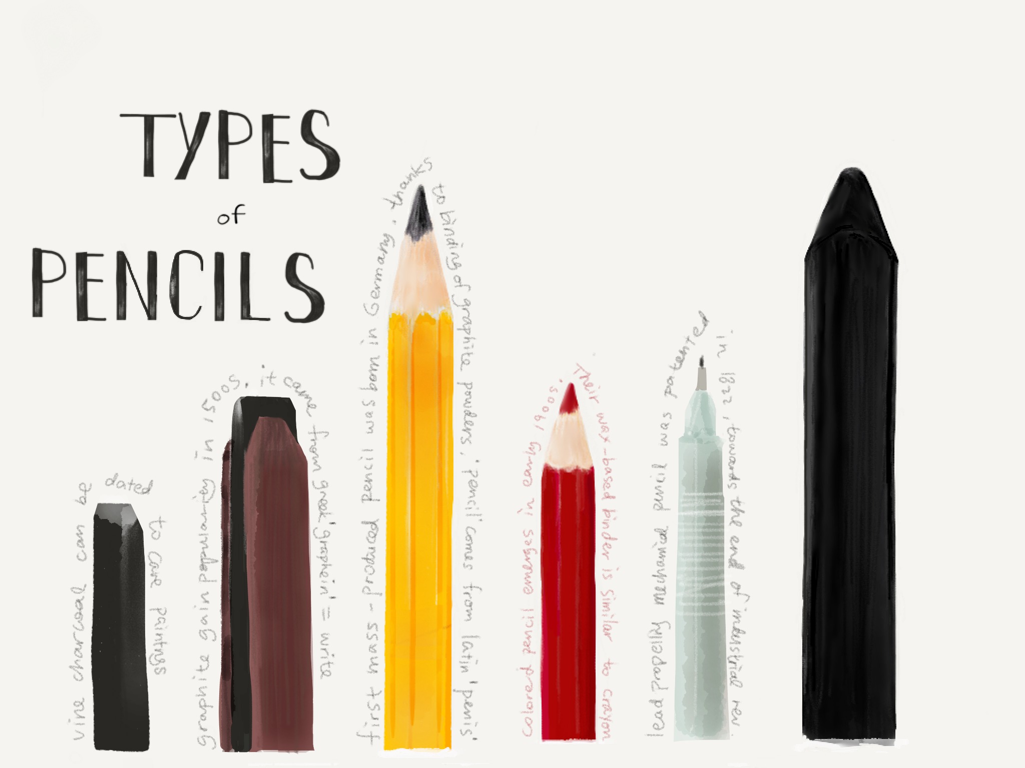
<img src="assets/img/pencils.jpg" alt="Awesome Image">
</div>
<div class="item">
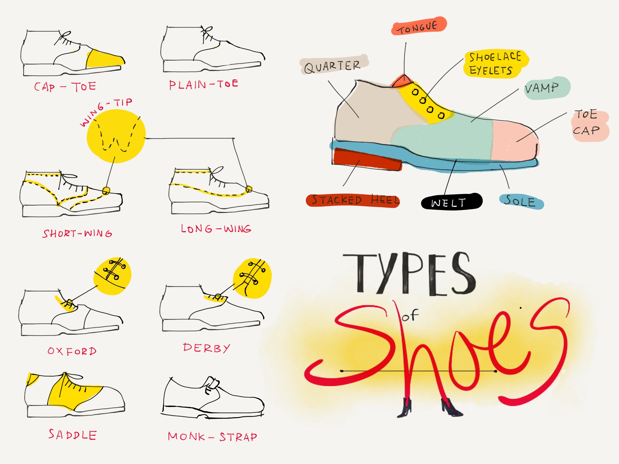
<img src="assets/img/shoes.jpg" alt="Awesome Image">
</div>
<div class="item">
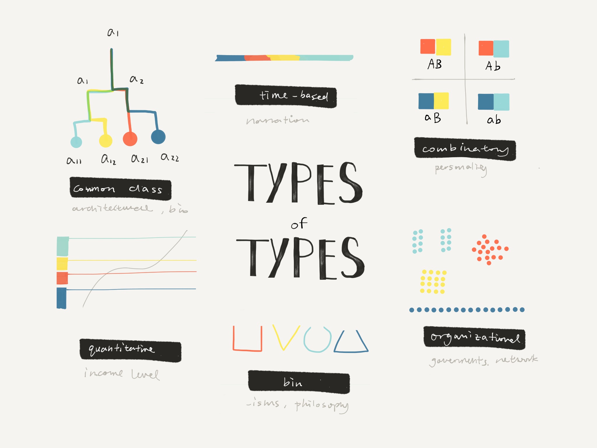
<img src="assets/img/types.jpg" alt="Awesome Image">
</div>
</div>
<!-- Controls -->
<a class="left carousel-control" href="#carousel-example-generic" data-slide="prev">
<span class="fa fa-angle-left"></span>
</a>
<a class="right carousel-control" href="#carousel-example-generic" data-slide="next">
<span class="fa fa-angle-right"></span>
</a>
</div>
</div>
</div>
<!-- javascript for init -->
$('.carousel').carousel({
interval: 4000
});
If you are building a gallery, we styled a plugin that will fit your needs. We have built on top of PhotoSwipe, which is a responsive Javascript library, with no dependencies. It support finger gestures and has an amazing documentation that you can see here: https://photoswipe.com/ We styled it to look like the rest of the elements inside the kit.
You can see an example below, along with the html implementation and the Javascript initialisation.
<!-- Root element of PhotoSwipe. Must have class pswp. -->
<div class="pswp" tabindex="-1" role="dialog" aria-hidden="true">
<!-- Background of PhotoSwipe.
It's a separate element as animating opacity is faster than rgba(). -->
<div class="pswp__bg"></div>
<!-- Slides wrapper with overflow:hidden. -->
<div class="pswp__scroll-wrap">
<!-- Container that holds slides.
PhotoSwipe keeps only 3 of them in the DOM to save memory.
Don't modify these 3 pswp__item elements, data is added later on. -->
<div class="pswp__container">
<div class="pswp__item"></div>
<div class="pswp__item"></div>
<div class="pswp__item"></div>
</div>
<!-- Default (PhotoSwipeUI_Default) interface on top of sliding area. Can be changed. -->
<div class="pswp__ui pswp__ui--hidden">
<div class="pswp__top-bar">
<!-- Controls are self-explanatory. Order can be changed. -->
<div class="pswp__counter"></div>
<button class="pswp__button pswp__button--close" title="Close (Esc)"></button>
<button class="pswp__button pswp__button--share" title="Share"></button>
<button class="pswp__button pswp__button--fs" title="Toggle fullscreen"></button>
<button class="pswp__button pswp__button--zoom" title="Zoom in/out"></button>
<!-- Preloader demo https://codepen.io/dimsemenov/pen/yyBWoR -->
<!-- element will get class pswp__preloader--active when preloader is running -->
<div class="pswp__preloader">
<div class="pswp__preloader__icn">
<div class="pswp__preloader__cut">
<div class="pswp__preloader__donut"></div>
</div>
</div>
</div>
</div>
<div class="pswp__share-modal pswp__share-modal--hidden pswp__single-tap">
<div class="pswp__share-tooltip"></div>
</div>
<button class="pswp__button pswp__button--arrow--left" title="Previous (arrow left)">
</button>
<button class="pswp__button pswp__button--arrow--right" title="Next (arrow right)">
</button>
<div class="pswp__caption">
<div class="pswp__caption__center"></div>
</div>
</div>
</div>
</div>
<div class="my-gallery" itemscope itemtype="https://schema.org/ImageGallery">
<div class="row">
<figure itemprop="associatedMedia" itemscope itemtype="https://schema.org/ImageObject" class="col-md-5 col-sm-6 gallery-item">
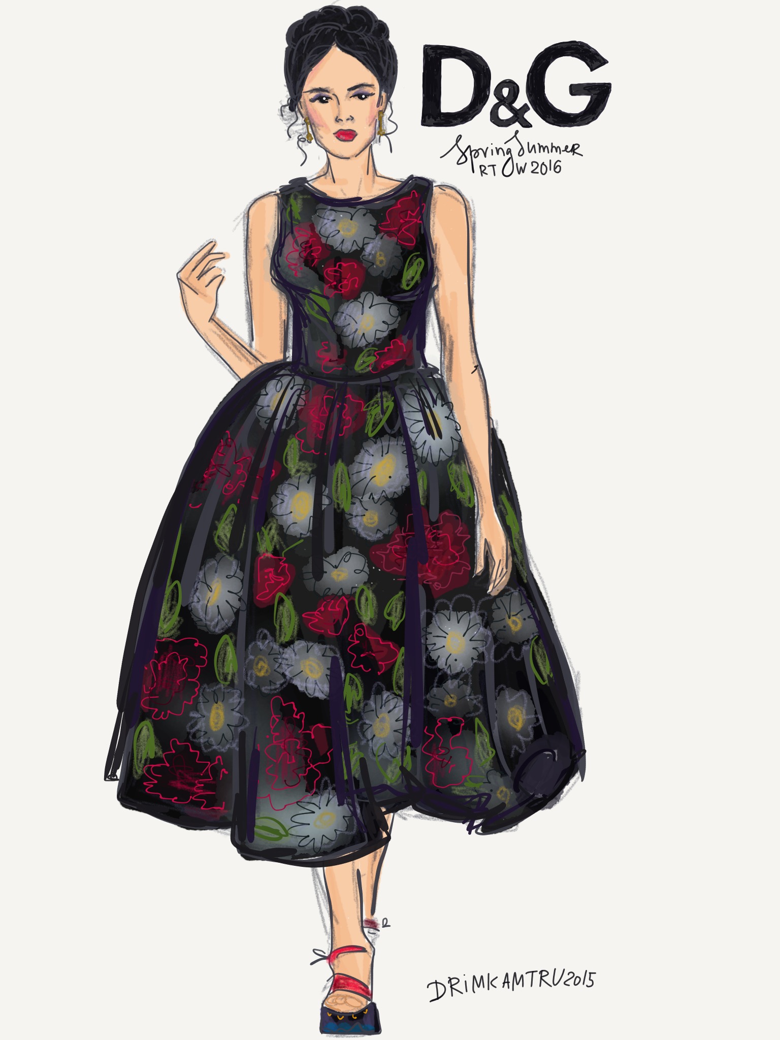
<a href="assets/img/gallery/dg.jpeg" itemprop="contentUrl" data-size="1536x2048">
<img src="assets/img/gallery/dg.jpeg" itemprop="thumbnail" alt="Image description" class="vertical-image img-rounded img-responsive" />
</a>
<figcaption itemprop="caption description" class="gallery-caption">Dolce & Gabbana</figcaption>
</figure>
<figure itemprop="associatedMedia" itemscope itemtype="https://schema.org/ImageObject" class="col-md-5 col-sm-6 gallery-item">
<a href="assets/img/gallery/saab.jpeg" itemprop="contentUrl" data-size="1536x2048">
<img src="assets/img/gallery/saab.jpeg" itemprop="thumbnail" alt="Image description" class="vertical-image img-rounded img-responsive" />
</a>
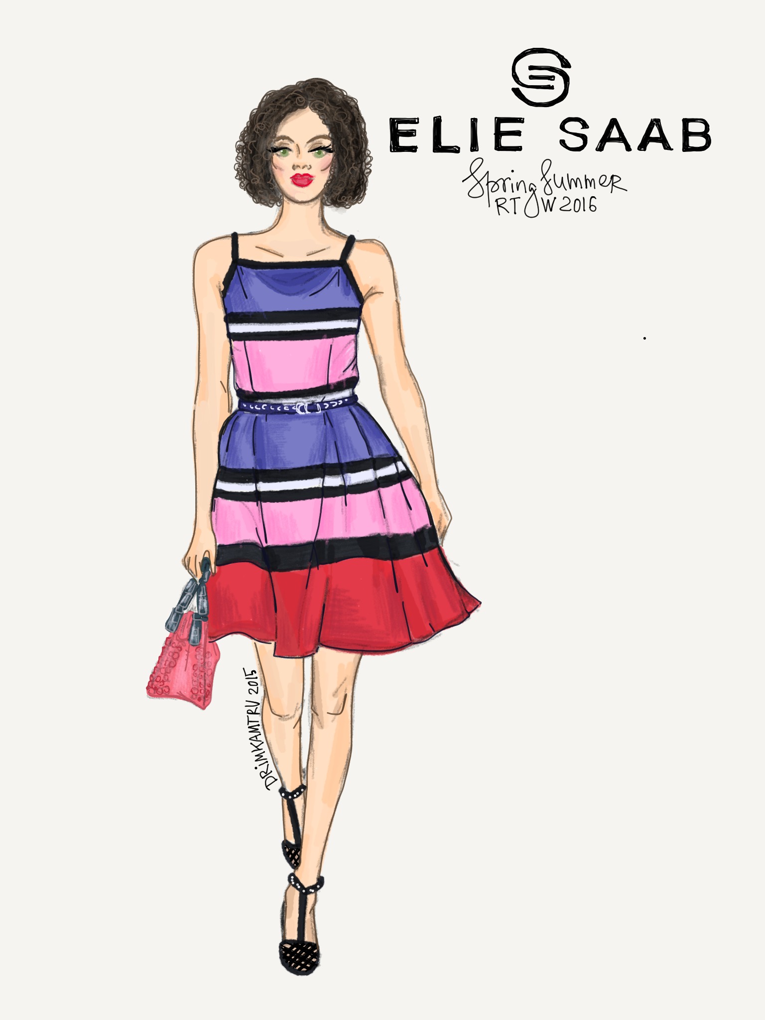
<figcaption itemprop="caption description" class="gallery-caption">Ellie Saab</figcaption>
</figure>
</div>
</div>
<!-- photoswipe javasscript files -->
<script src="assets/js/photo_swipe/photoswipe.min.js"></script>
<script src="assets/js/photo_swipe/photoswipe-ui-default.min.js"></script>
<script src="assets/js/photo_swipe/init-gallery.js"></script>
For the implementation of graphic charts, we used the Chartist plugin and added our custom styles. The plugin is free to download and use here. The guys behind the project did an awesome job and we recommend using it. Besides all the great customisation that you have using it, it is also fully responsive.
We recommend using this chart when you have information that is easy to understand, that can be conveyed in a single line throughout a continuous period.
    <!-- graphic area in html -->


    <h4> <br><small>24 Hours Performance</small></h4>

    <div id="chartPerformance" class="ct-chart ct-perfect-fourth"></div>


    <!-- javascript -->

    var dataPerformance = {

      labels: ['9pm', '2am', '8am', '2pm', '8pm'],

      series: [

        [1, 6, 8, 7, 4, 7, 8, 12, 16, 17, 14, 13]

      ]

    };


    var optionsPerformance = {

      showPoint: false,

      lineSmooth: true,

      axisX: {

        showGrid: false,

        showLabel: true

      },

      axisY: {

        offset: 40,

      },

      low: 0,

      high: 20

    };


    Chartist.Line('#chartPerformance', dataPerformance, optionsPerformance);
This graphic is best used when you have multiple results for different points and you want to show a correlation (growth, down-side, etc).
    <!-- graphic area in html -->

    <h4></small> <br><small>NASDAQ: AAPL</small></h4>

    <div id="chartStock" class="ct-chart ct-perfect-fourth"></div>


    <!-- javascript -->

    var dataStock = {

      labels: ['2009', '2010', '2011', '2012', '2013', '2014'],

      series: [

        [22.20, 28.16, 34.90, 42.28, 47.26, 48.89, 51.93, 55.32, 59.21, 62.21, 75.50, 80.23, 60.32, 55.03, 62.21, 78.83, 82.12, 89.21, 102.50, 107.23]

      ]

    };


    var optionsStock = {

      lineSmooth: false,

      axisY: {

        offset: 40,

        labelInterpolationFnc: function(value) {

            return '$' + value;

          }


      },

      low: 10,

      high: 110,

       classNames: {

          point: 'ct-point ct-green',

          line: 'ct-line ct-green'

      }

    };


    var $chart = $('#chartStock');


    Chartist.Line('#chartStock', dataStock, optionsStock);
We recommend you use this graphic when you need to show multiple functions in the same visual element. For example, you can see a correlation between the registered versus active users. Always try to use a legend when you have multiple elements in the graphic.
    <!-- graphic area in html -->

    <h4><small>Users Behavior</small></h4>

    <div id="chartSales" class="ct-chart ct-perfect-fourth"></div>

    <h6>Legend</h6>

    <i class="fa fa-circle text-info"></i> Visited Site<br>

    <i class="fa fa-circle text-success"></i> Register<br>

    <i class="fa fa-circle text-warning"></i> Login 2nd time


    <!-- javascript -->

    var dataSales = {

      labels: ['2009', '2010', '2011', '2012', '2013', '2014'],

      series: [

        [287, 385, 490, 492, 554, 586, 698, 695, 752, 788, 846, 944],

        [67, 152, 143, 240, 287, 335, 435, 437, 539, 542, 544, 647],

        [23, 113, 67, 108, 190, 239, 307, 308, 439, 410, 410, 509]

      ]

    };


    var optionsSales = {

      lineSmooth: false,

      axisY: {

        offset: 40

      },

      low: 0,

      high: 1000

    };


    Chartist.Line('#chartSales', dataSales, optionsSales);
A pie chart is the easiest way to represent an information. Use it whenever you want to show something understandable at once.
    <!-- graphic area in html -->

    <h4><small>Public Preferences</small></h4>

    <div class="row margin-top">

     <div class="col-md-10 col-md-offset-1">

         <div id="chartPreferences" class="ct-chart ct-perfect-fourth"></div>

     </div>

    </div>

    <div class="row">

     <div class="col-md-10 col-md-offset-1">

         <h6>Legend</h6>

         <i class="fa fa-circle text-info"></i> Apple

         <i class="fa fa-circle text-success"></i> Samsung

         <i class="fa fa-circle text-warning"></i> BlackBerry

         <i class="fa fa-circle text-danger"></i> Windows Phone

     </div>

    </div>


    <!-- javascript -->

    Chartist.Pie('#chartPreferences', {

      labels: ['46%','28%','15%','11%'],

      series: [46, 28, 15, 11]

    });
We recommend using the bar chart whenever you want to show progress over periods of time. Here is an example.
    <!-- graphic area in html -->

    <h4><small>Views</small></h4>

    <div id="chartViews" class="ct-chart ct-perfect-fourth"></div>


    <!-- javascript -->

    var dataViews = {

      labels: ['Jan', 'Feb', 'Mar', 'Apr', 'Mai', 'Jun', 'Jul', 'Aug', 'Sep', 'Oct', 'Nov', 'Dec'],

      series: [

        [542, 443, 320, 780, 553, 453, 326, 434, 568, 610, 756, 895]

      ]

    };


    var optionsViews = {

      seriesBarDistance: 10,

      classNames: {

        bar: 'ct-bar ct-azure'

      },

      axisX: {

        showGrid: false

      }

    };


    var responsiveOptionsViews = [

      ['screen and (max-width: 640px)', {

        seriesBarDistance: 5,

        axisX: {

          labelInterpolationFnc: function (value) {

            return value[0];

          }

        }

      }]

    ];


    Chartist.Bar('#chartViews', dataViews, optionsViews, responsiveOptionsViews);
Go for multiple bars charts if you want to show two indicators side by side.
    <!-- graphic area in html -->

    <h4>Activity <br><small>Multiple Bars Chart</small></h4>

    <div id="chartActivity" class="ct-chart ct-perfect-fourth"></div>

    <h6>Legend</h6>

    <span class="label label-info">Views</span>

    <span class="label label-success">Reads</span>


    <!-- javascript -->

    var data = {

      labels: ['Jan', 'Feb', 'Mar', 'Apr', 'Mai', 'Jun', 'Jul', 'Aug', 'Sep', 'Oct', 'Nov', 'Dec'],

      series: [

        [542, 443, 320, 780, 553, 453, 326, 434, 568, 610, 756, 895],

        [412, 243, 280, 580, 453, 353, 300, 364, 368, 410, 636, 695]

      ]

    };


    var options = {

      seriesBarDistance: 10,

       axisX: {

            showGrid: false

        }

    };


    var responsiveOptions = [

      ['screen and (max-width: 640px)', {

        seriesBarDistance: 5,

        axisX: {

          labelInterpolationFnc: function (value) {

            return value[0];

          }

        }

      }]

    ];


    Chartist.Bar('#chartActivity', data, options, responsiveOptions);
We have created a strong variety of cards. We think cards are one of the best way to organise your information. We went all out with possibilities and we recommended finding the right fit for your product. The general class for a card is called "card". The general structure for a card has 3 sections. The first one is the header ('header' class), used for the title; which can also support an icon by adding the 'header-icon' class. The second one is the content (class 'content'), that can have three types of elements inside: 'title', 'description' and 'category'. You can optionally add a 'card-footer', if you want to place a call-to-action.
There are three types of shadows you can add to your card: the default one that comes with the 'card' class, a subtle shadow that you can obtain with the 'card-with-shadow' class and a very impressive one, that replicates the look of a piece of paper, that comes with the class 'card-big-shadow'.
Below you can see the three types of shadow that you ca use:
<!-- simple card -->
<div class="card">
    <div class="content">
        <h6 class="category">Best stories</h6>
        <h4 class="title"><a href="#">This is a simple card</a></h4>
        <p class="description">Cards are an interaction model... </p>
    </div>
</div>

<!--  card with shadow -->
<div class="card card-with-shadow">
    <div class="content">
        <h6 class="category">Best stories</h6>
        <h4 class="title"><a href="#">This is a card with shadow</a></h4>
        <p class="description">Cards are an interaction model... </p>
    </div>
</div>

<!-- card with big shadow -->
<div class="card-big-shadow">
    <div class="card" data-radius="none">
        <div class="content">
            <h6 class="category">Best stories</h6>
            <h4 class="title"><a href="#">Card with an impressive shadow</a></h4>
            <p class="description">Cards are an interaction model... </p>
        </div>
    </div>
</div>
For every type of card (simple, with shadow and with a big shadow), there are also colour variations. To set your colour, you need to add the attribute 'data-background="color"' to the card div, and also specify the colour with 'data-color="blue/green/yellow/brown/purple/orange"'.
Here is an example with the implementation.
What all of these have in common is that they're pulling information out of the app or the service and making it relevant to the moment.
<!-- blue card -->
<div class="card-big-shadow">
    <div class="card card-just-text" data-background="color" data-color="blue" data-radius="none">
        <div class="content">
            <h6 class="category">Best cards</h6>
            <h4 class="title"><a href="#">Blue Card</a></h4>
            <p class="description">What all of these have in common is that they're pulling information out of the app or the service and making it relevant to the moment. </p>
        </div>
    </div> <!-- end card -->
</div>
If you want to add different effects and styles, besides the shadow and the colour, we have created a couple of more specific classes. If you want your card to have a bigger padding, you can add the 'card-just-text'. If you want to use your card to display an image, you can use the class 'card-image'. If you want your card to rise a bit when you hover over it, you can add the class 'card-hover-effect'. We have also added the possibility to add a button for more actions regarding the card (like sharing).
You can see more variations and the implementation below.
- Your card
- Random Quote
What all of there is. Here can be a description about the application that is for download.
<!-- card with padding -->
<div class="card card-just-text card-with-shadow" data-background="color" data-color="orange" >
    <div class="content">
        <h6 class="category">Text Card</h6>
        <h4 class="title">"The more you know who you are and what you want, the less you let things upset you."</h4>
        <p class="description">- Your card</p>
    </div>
</div>

<!-- card with image -->
<div class="card-big-shadow card-image">
    <div class="card" data-radius="none" style="background-image: url('assets/img/red_small.jpg');">
    </div> <!-- end card -->
</div>

<!-- yellow card with sharing -->
<div class="card card-just-text card-with-shadow" data-background="color" data-color="yellow" >
    <div class="more">
        <div class="dropdown">
          <button id="dLabel" type="button" class="btn btn-icon btn-simple btn-lg btn-warning" data-toggle="dropdown" aria-haspopup="true" aria-expanded="false">
            <i class="ti-share"></i>
          </button>
          <ul class="dropdown-menu dropdown-sharing dropdown-menu-right dropdown-medium" aria-labelledby="dLabel">
                <li class="dropdown-header text-center">Sharing is caring!</li>
                <li>
                    <div class="social-line">
                        <div class="row">
                            <div class="col-xs-2">
                                <span class="icon-twitter"><i class="ti-twitter-alt"></i></span>
                            </div>
                            <div class="col-xs-6">Twitter</div>
                            <div class="col-xs-4">
                                <div class="switch"
                                  data-on-label="<i class='ti-check'></i>"
                                  data-off-label="<i class='ti-close'></i>">
                                  <input type="checkbox" checked class="ct-success"/>
                                </div>
                            </div>
                        </div>
                    </div>
                </li>
                <li class="divider"></li>
                <li>
                    <div class="social-line">
                        <div class="row">
                            <div class="col-xs-2">
                                <span class="icon-facebook"><i class="ti-facebook"></i></span>
                            </div>
                            <div class="col-xs-6">Facebook</div>
                            <div class="col-xs-4">
                                <div class="switch"
                                  data-on-label="<i class='ti-check'></i>"
                                  data-off-label="<i class='ti-close'></i>">
                                  <input type="checkbox" class="ct-success"/>
                                </div>
                            </div>
                        </div>
                    </div>
                </li>
                <li class="divider"></li>
                <li>
                    <div class="social-line">
                        <div class="row">
                            <div class="col-xs-2">
                                <span class="icon-pinterest"><i class="ti-pinterest"></i></span>
                            </div>
                            <div class="col-xs-6">Pinterest</div>
                            <div class="col-xs-4">
                                <div class="switch"
                                  data-on-label="<i class='ti-check'></i>"
                                  data-off-label="<i class='ti-close'></i>">
                                  <input type="checkbox" class="ct-success"/>
                                </div>
                            </div>
                        </div>
                    </div>
                </li>
                <li><a href="#">
                    <button class="btn btn-block btn-fill btn-info">Share</button>

                </a></li>
          </ul>
        </div>
    </div>

    <div class="content">
        <h6 class="category">Card with Sharing</h6>
        <h4 class="title">"In the end we only <b>regret</b> the chances we didn't take."</h4>
        <p class="description">- Random Quote</p>
    </div>
</div>

<!-- card with hover -->
<div class="card card-hover-effect card-just-text" data-background="color" data-color="green">

    <div class="content text-center">
        <h6 class="category">Best cards</h6>
        <h4 class="title"><a href="#">Card with hover effect</a></h4>
        <p class="description">What all of there is. Here can be a description about the application that is for download. </p>
    </div>
</div>
We have created a special set of cards, if you want to present your team or use them as links to user profiles. They come in two options: the simple card and the card with cover. The 'avatar' class is used for the photo of the person. The default style is without border, if you want to add a white border you can use 'border-white', and if you want it gray, you can use 'border-gray'.
Here is an example with cover and avatar with white border and the implementation.

This is a private user.
<div class="card card-user">
    <div class="image">
         <img src="assets/img/image_placeholder.jpg" alt="..."/>
    </div>
    <div class="content">
        <div class="author">
             <a href="#">
            <img class="avatar border-white" src="assets/img/placeholder.jpg" alt="..."/>

              <h4 class="title">Anonymous Tim</h4>
            </a>
        </div>
        <p class="description text-center">
            This is a private user.
        </p>
    </div>
    <div class="card-footer text-center">
        <button href="#" class="btn btn-icon"><i class="ti-plus"></i></button>
    </div>
</div>
If you want to showcase visual items, we have created special sets of cards: one what features creators and one that shows the price or the option for another action.
Here are two examples and the implementation.
<!-- card with creator -->
<div class="card-image">
<a href="#">
<img src="assets/img/cats.jpg" alt="Rounded Image" class="img-rounded img-responsive">
</a>
<div class="details details-center">
<a href="#">
<div class="author">
<img src="assets/img/placeholder.jpg" alt="Circle Image" class="img-circle img-no-padding img-responsive">
<div class="text">
<span class="name">Tom Hanks</span>
<div class="meta">Drawn on 23 Jan</div>
</div>
</div>
</a>
</div>
</div>
<!-- card with price -->
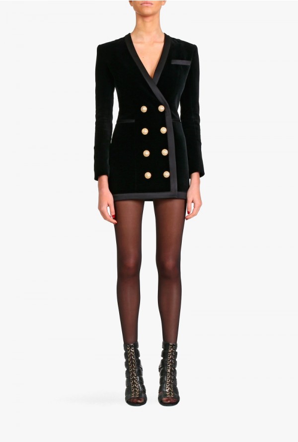
<div class="card-image card-product">
<a href="#">
<img src="assets/img/balmain-1.jpg" alt="Rounded Image" class="img-rounded img-responsive">
</a>
<div class="details">
<div class="description">
<div class="name">Double Breasted Mini Dress</div>
<div class="meta">Dresses & Skirts</div>
</div>
<div class="actions">
<h5>300$</h5>
</div>
</div>
</div>
We have created multiple options for the background of sections. The default 'section' class adds a subtle top-to-bottom gradient over the background colour provided. You can combine it with the following classes to get the desired background.