Table
We've done this component to make it a bit more easier for you to populate and render a table.
Styles
You will find the styles for this component instyles/jss/nextjs-material-kit-pro/components/tableStyle.js.
Examples
Simple With Actions
| # | Name | Job Position | Since | Salary | Actions |
|---|---|---|---|---|---|
| 1 | Andrew Mike | Develop | 2013 | € 99,225 | |
| 2 | John Doe | Design | 2012 | € 89,241 | |
| 3 | Alex Mike | Design | 2010 | € 92,144 |
import React from "react";
// @material-ui/core components
import { makeStyles } from "@material-ui/core/styles";
// material-ui icons
import Person from "@material-ui/icons/Person";
import Edit from "@material-ui/icons/Edit";
import Close from "@material-ui/icons/Close";
// core components
import Table from "components/Table/Table.js";
import Button from "components/CustomButtons/Button.js";

import style from "styles/jss/nextjs-material-kit-pro/pages/componentsSections/contentAreas.js";

const useStyles = makeStyles(style);

export default function Tables() {
  const classes = useStyles();
  const fillButtons = [
    { color: "info", icon: Person },
    { color: "success", icon: Edit },
    { color: "danger", icon: Close }
  ].map((prop, key) => {
    return (
      <Button justIcon size="sm" color={prop.color} key={key}>
        <prop.icon />
      </Button>
    );
  });
  const simpleButtons = [
    { color: "info", icon: Person },
    { color: "success", icon: Edit },
    { color: "danger", icon: Close }
  ].map((prop, key) => {
    return (
      <Button simple justIcon size="sm" color={prop.color} key={key}>
        <prop.icon />
      </Button>
    );
  });
  const roundButtons = [
    { color: "info", icon: Person },
    { color: "success", icon: Edit },
    { color: "danger", icon: Close }
  ].map((prop, key) => {
    return (
      <Button round justIcon size="sm" color={prop.color} key={key}>
        <prop.icon />
      </Button>
    );
  });
  return (
    <Table
      tableHead={["#", "Name", "Job Position", "Since", "Salary", "Actions"]}
      tableData={[
        ["1", "Andrew Mike", "Develop", "2013", "€ 99,225", fillButtons],
        ["2", "John Doe", "Design", "2012", "€ 89,241", roundButtons],
        ["3", "Alex Mike", "Design", "2010", "€ 92,144", simpleButtons]
      ]}
      customCellClasses={[
        classes.textCenter,
        classes.textRight,
        classes.textRight
      ]}
      customClassesForCells={[0, 4, 5]}
      customHeadCellClasses={[
        classes.textCenter,
        classes.textRight,
        classes.textRight
      ]}
      customHeadClassesForCells={[0, 4, 5]}
    />
  );
}
Striped With Checkboxes
| # | Product Name | Type | Qty | Price | Amount | |
|---|---|---|---|---|---|---|
| 1 | Moleskine Agenda | Office | 25 | € 49 | € 1,225 | |
| 2 | Stabilo Pen | Office | 30 | € 10 | € 300 | |
| Total | €1,525 | |||||
import React from "react";
// @material-ui/core components
import { makeStyles } from "@material-ui/core/styles";
import Checkbox from "@material-ui/core/Checkbox";
// material-ui icons
import Check from "@material-ui/icons/Check";
// core components
import Table from "components/Table/Table.js";

import style from "styles/jss/nextjs-material-kit-pro/pages/componentsSections/contentAreas.js";

const useStyles = makeStyles(style);

export default function Tables() {
  const [checked, setChecked] = React.useState([1, 3, 5]);
  const handleToggle = value => {
    const currentIndex = checked.indexOf(value);
    const newChecked = [...checked];

    if (currentIndex === -1) {
      newChecked.push(value);
    } else {
      newChecked.splice(currentIndex, 1);
    }
    setChecked(newChecked);
  };
  const classes = useStyles();
  return (
    <Table
      striped
      tableHead={["#", "", "Product Name", "Type", "Qty", "Price", "Amount"]}
      tableData={[
        [
          "1",
          <Checkbox
            checked={checked.indexOf(1) !== -1}
            tabIndex={-1}
            onClick={() => handleToggle(1)}
            checkedIcon={<Check className={classes.checkedIcon} />}
            icon={<Check className={classes.uncheckedIcon} />}
            classes={{
              checked: classes.checked,
              root: classes.checkRoot
            }}
          />,
          "Moleskine Agenda",
          "Office",
          "25",
          "€ 49",
          "€ 1,225"
        ],
        [
          "2",
          <Checkbox
            checked={checked.indexOf(2) !== -1}
            tabIndex={-1}
            onClick={() => handleToggle(2)}
            checkedIcon={<Check className={classes.checkedIcon} />}
            icon={<Check className={classes.uncheckedIcon} />}
            classes={{
              checked: classes.checked,
              root: classes.checkRoot
            }}
          />,
          "Stabilo Pen",
          "Office",
          "30",
          "€ 10",
          "€ 300"
        ],
        {
          total: true,
          colspan: "5",
          amount: (
            <span>
              <small>€</small>1,525
            </span>
          )
        }
      ]}
      customCellClasses={[
        classes.textCenter,
        classes.padding0,
        classes.textRight,
        classes.textRight
      ]}
      customClassesForCells={[0, 1, 5, 6]}
      customHeadCellClasses={[
        classes.textCenter,
        classes.textRight,
        classes.textRight
      ]}
      customHeadClassesForCells={[0, 5, 6]}
    />
  );
}
Shopping Cart Table
| PRODUCT | COLOR | SIZE | PRICE | QTY | AMOUNT | ||
|---|---|---|---|---|---|---|---|
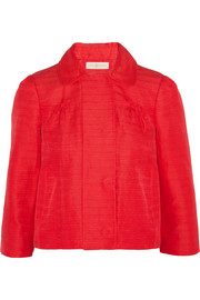 | Spring Jacket by Dolce&Gabbana | Red | M | € 549 | 1 | € 549 | |
| Total | €2,346 | ||||||
import React from "react";
// @material-ui/core components
import { makeStyles } from "@material-ui/core/styles";
import Tooltip from "@material-ui/core/Tooltip";
// material-ui icons
import Close from "@material-ui/icons/Close";
import Remove from "@material-ui/icons/Remove";
import Add from "@material-ui/icons/Add";
import KeyboardArrowRight from "@material-ui/icons/KeyboardArrowRight";
// core components
import Table from "components/Table/Table.js";
import Button from "components/CustomButtons/Button.js";
import style from "styles/jss/nextjs-material-kit-pro/pages/componentsSections/contentAreas.js";
const useStyles = makeStyles(style);
export default function Tables() {
const classes = useStyles();
return (
<Table
tableHead={["", "PRODUCT", "COLOR", "SIZE", "PRICE", "QTY", "AMOUNT", ""]}
tableData={[
[
<div className={classes.imgContainer}>
<img src="/img/product1.jpg" alt="..." className={classes.img} />
</div>,
<span>
<a href="#jacket" className={classes.tdNameAnchor}>
Spring Jacket
</a>
<br />
<small className={classes.tdNameSmall}>by Dolce&Gabbana</small>
</span>,
"Red",
"M",
<span>
<small className={classes.tdNumberSmall}>€</small> 549
</span>,
<span>
1{" "}
<div className={classes.buttonGroup}>
<Button
color="info"
size="sm"
round
className={classes.firstButton}
>
<Remove />
</Button>
<Button
color="info"
size="sm"
round
className={classes.lastButton}
>
<Add />
</Button>
</div>
</span>,
<span>
<small className={classes.tdNumberSmall}>€</small> 549
</span>,
<Tooltip
id="close1"
title="Remove item"
placement="left"
classes={{ tooltip: classes.tooltip }}
>
<Button link className={classes.actionButton}>
<Close />
</Button>
</Tooltip>
],
{
purchase: true,
colspan: "3",
amount: (
<span>
<small>€</small>2,346
</span>
),
col: {
colspan: 3,
text: (
<Button color="info" round>
Complete Purchase <KeyboardArrowRight />
</Button>
)
}
}
]}
tableShopping
customHeadCellClasses={[
classes.textCenter,
classes.description,
classes.description,
classes.textRight,
classes.textRight,
classes.textRight
]}
customHeadClassesForCells={[0, 2, 3, 4, 5, 6]}
customCellClasses={[
classes.tdName,
classes.customFont,
classes.customFont,
classes.tdNumber,
classes.tdNumber + " " + classes.tdNumberAndButtonGroup,
classes.tdNumber + " " + classes.textCenter
]}
customClassesForCells={[1, 2, 3, 4, 5, 6]}
/>
);
}
Props
CustomTable.defaultProps = {
  tableHeaderColor: "gray",
  hover: false,
  colorsColls: [],
  coloredColls: [],
  striped: false,
  customCellClasses: [],
  customClassesForCells: [],
  customHeadCellClasses: [],
  customHeadClassesForCells: []
};

CustomTable.propTypes = {
  tableHeaderColor: PropTypes.oneOf([
    "warning",
    "primary",
    "danger",
    "success",
    "info",
    "rose",
    "gray"
  ]),
  tableHead: PropTypes.arrayOf(PropTypes.string),
  // Of(PropTypes.arrayOf(PropTypes.node)) || Of(PropTypes.object),
  tableData: PropTypes.array,
  hover: PropTypes.bool,
  coloredColls: PropTypes.arrayOf(PropTypes.number),
  // Of(["warning","primary","danger","success","info","rose","gray"]) - colorsColls
  colorsColls: PropTypes.array,
  customCellClasses: PropTypes.arrayOf(PropTypes.string),
  customClassesForCells: PropTypes.arrayOf(PropTypes.number),
  customHeadCellClasses: PropTypes.arrayOf(PropTypes.string),
  customHeadClassesForCells: PropTypes.arrayOf(PropTypes.number),
  striped: PropTypes.bool,
  // this will cause some changes in font
  tableShopping: PropTypes.bool
};