# Cards
We think cards are one of the best ways to organise your information. We went all out with possibilities and we recommended finding the right fit for your product.
# Login card
import {LoginCard} from '@/components'
# Local Usage
components: {
  LoginCard
}
# Global Usage
Vue.component(LoginCard)
# Example card
Login
Or Be Classical
# LoginCard Slots
| Name | Description |
|---|---|
| title | Default card title |
| description | Default card description |
| buttons | card buttons |
| footer | Content for card footer |
# Blog Card
import {BlogCard} from '@/components'
# Local Usage
components: {
  BlogCard
}
# Global Usage
Vue.component(BlogCard)
# Example card
ENTERPRISE
Autodesk looks to future of 3D printing with Project Escher
Like so many organizations these days, Autodesk is a company in transition. It was until recently a traditional boxed software company selling licenses. Read More
# BlogCard Slots
| Name | Description |
|---|---|
| cardTitleHeader | Default card title |
| cardContent | Default card content |
| cardAction | Default card footer |
# Full Background Card
import {FullBgCard} from '@/components'
# Local Usage
components: {
  FullBgCard
}
# Global Usage
Vue.component(FullBgCard)
# Example card
Productivy Apps
The Best Productivity Apps on Market
Don't be scared of the truth because we need to restart the human foundation in truth And I love you like Kanye loves Kanye I love Rick Owens’ bed design but the back is...
# Full Background Card Slots
| Name | Description |
|---|---|
| cardContent | Default card content |
# Pricing Card
import {PricingCard} from '@/components'
# Local Usage
components: {
  PricingCard
}
# Global Usage
Vue.component(PricingCard)
# Example card
# Pricing Card Slots
| Name | Description |
|---|---|
| cardCategory | Default card category subtitle |
| cardContent | Default card content |
| cardAction | Default card footer |
# Product Card
import {ProductCard} from '@/components'
# Local Usage
components: {
  ProductCard
}
# Global Usage
Vue.component(ProductCard)
# Example card
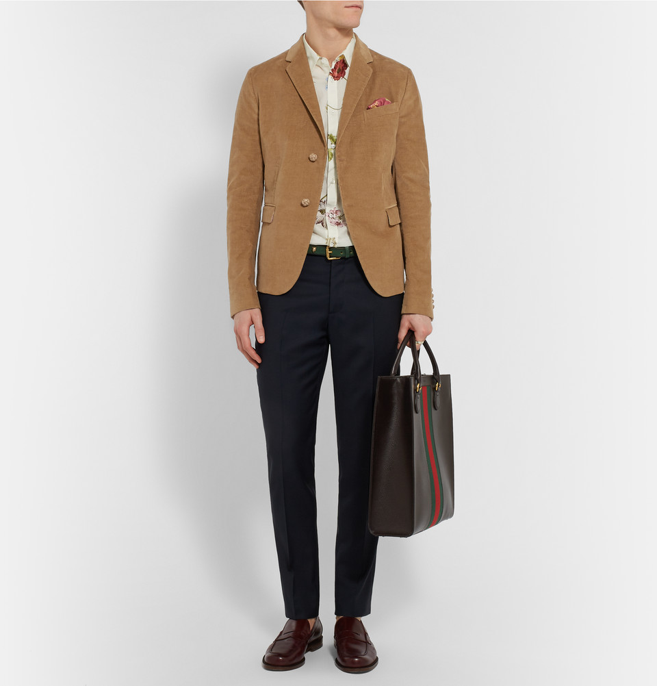
Gucci
The structured shoulders and sleek detailing ensure a sharp silhouette. Team it with a silk pocket square and leather loafers.
# Product Card Slots
| Name | Description |
|---|---|
| cardContent | Default card content |
| cardAction | Default card footer |
# Profile Card
import {ProfileCard} from '@/components'
# Local Usage
components: {
  ProfileCard
}
# Global Usage
Vue.component(ProfileCard)
# Example card

Web Designer
Don't be scared of the truth because we need to restart the human foundation in truth And I love you like Kanye loves Kanye I love Rick Owens’ bed design but the back is...
# Profile Card Slots
| Name | Description |
|---|---|
| cardTitleHeader | Default card title header |
| cardContent | Default card content |
| cardAction | Default card footer |
# Rotating Card
import {RotatingCard} from '@/components'
# Local Usage
components: {
  RotatingCard
}
# Global Usage
Vue.component(RotatingCard)
# Example card
Full Background Card
This Background Card Will Rotate on Hover
Don't be scared of the truth because we need to restart the human foundation in truth And I love you like Kanye loves Kanye I love Rick Owens’ bed design but the back is...
Full Background Card
This card is doing a full rotation, click on the rotate button
Don't be scared of the truth because we need to restart the human...
# Rotating Card Slots
| Name | Description |
|---|---|
| frontRotateCardContent | Default card front content |
| frontCardAction | Default card front footer |
| backCardAction | Default card back footer |
| backRotateCardContent | Default card back content |
# Testimonial Card
import {TestimonialCard} from '@/components'
# Local Usage
components: {
  TestimonialCard
}
# Global Usage
Vue.component(TestimonialCard)
# Example card
"Your products, all the kits that I have downloaded from your site and worked with are sooo cool! I love the color mixtures, cards... everything. Keep up the great work!"
Alec Thompson
@alecthompson

Gina West
CFO @ Apple Inc.
"I've been trying to figure out the bed design for the master bedroom at our Hidden Hills compound..."
# Testimonial Card Slots
| Name | Description |
|---|---|
| icon | Default card header icon |
| cardAvatarTop | Default card avatar image on top |
| cardContent | Default card content |
| cardAction | Default card footer |